All Prompts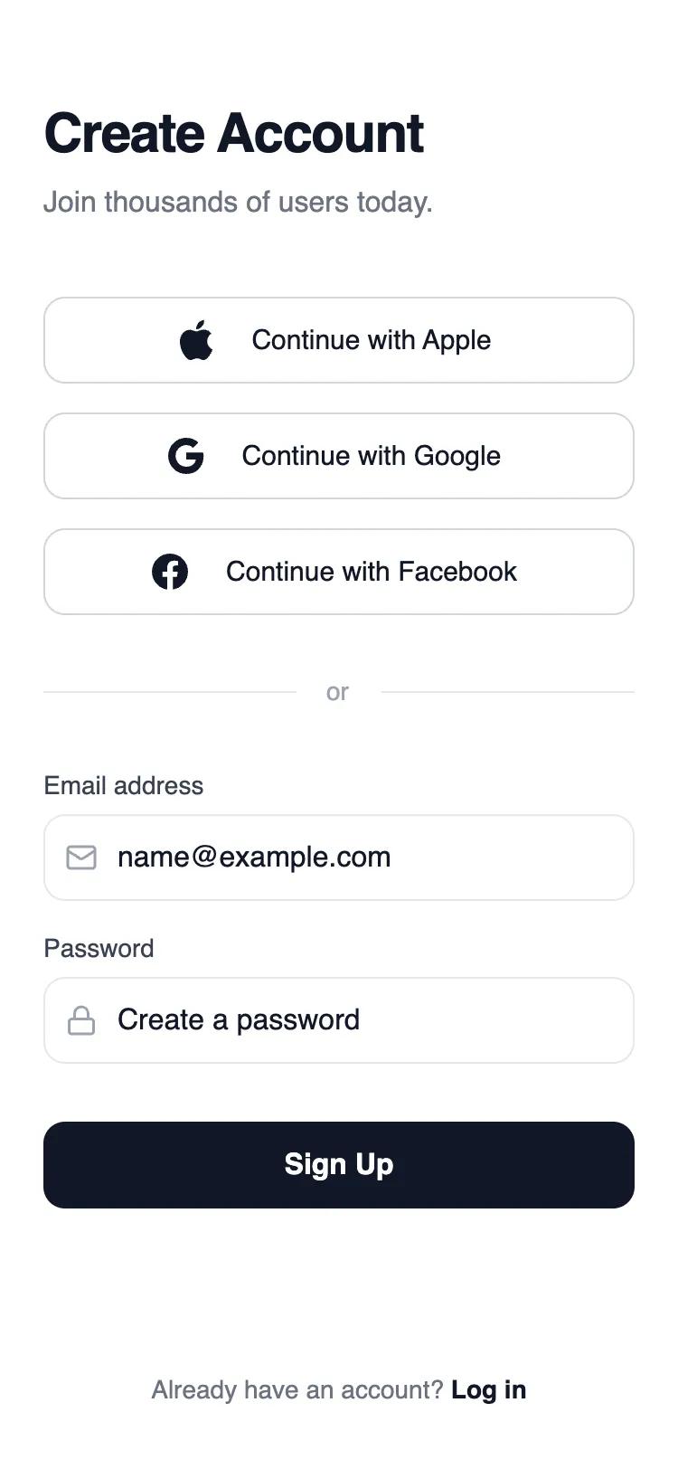 All Prompts
mobile applayoutsignupauth
Social first sign up
Минималистичный UI-шаблон для регистрации в мобильных приложениях через соцсети. Оптимизирован для конверсии, использует строгую типографику и контрастные элементы.
by Shirley LouLive Preview
Prompt
# Social first sign up

{
  "summary": "A clean, high-contrast mobile sign-up screen prioritizing social authentication via Apple, Google, and Facebook. The design utilizes a grayscale wireframe aesthetic with a 48px standard height for interactive elements, generous whitespace, and a clear visual hierarchy established through typographic weight and subtle dividers.",
  "style": {
    "description": "The style is defined by a 'monochrome-plus' aesthetic, primarily using grayscale (#FFFFFF to #111827) for a professional wireframe look. Typography is 'Plus Jakarta Sans' with heavy reliance on tracking-tight for headings and medium weights for interactive text. Components feature a consistent 12px (rounded-xl) border radius. Interaction states include background color shifts (Gray 50/100) and physical scale compression (98%) on buttons.",
    "prompt": "Create a design with a white (#FFFFFF) background and dark-mode-ready grayscale accents. Typography: Use 'Plus Jakarta Sans'. Headings: 30px (text-3xl), font-weight: 700, tracking-tight, color: #111827. Subtext: 16px, color: #6B7280. Button/Input Text: 15px, font-weight: 500. UI Colors: Borders at #E5E7EB (gray-200) for inputs and #D1D5DB (gray-300) for secondary buttons; primary CTA at #111827 with white text. Spacing: 48px (h-12) standard height for all buttons and inputs. Border Radius: 12px (rounded-xl). Animations: Transition durations of 150ms-200ms with ease-in-out; buttons should scale to 0.98 on active press. Focus States: Inputs should use a 1px solid ring of #111827 when active."
  },
  "layout_and_structure": {
    "description": "A vertical linear layout optimized for mobile screens. The structure flows from a descriptive header to a high-priority social stack, followed by a secondary email form separated by a subtle text-inclusive divider, and concludes with a persistent footer link.",
    "prompts": [
      {
        "part": "Header Section",
        "prompt": "Positioned at the top with 56px (pt-14) top padding and 24px (px-6) horizontal padding. Includes a vertical stack with 8px (gap-2) spacing containing a 3xl bold 'Create Account' title and a 16px medium-gray subtext."
      },
      {
        "part": "Social Authentication Stack",
        "prompt": "A vertical stack with 16px (gap-4) spacing. Features three full-width buttons, each 48px (h-12) tall. Each button contains a 24px (text-2xl) icon on the left followed by 'Continue with [Provider]' text. Border: 1px solid #D1D5DB. Background: White. Hover: #F9FAFB."
      },
      {
        "part": "Visual Divider",
        "prompt": "Centered vertically between social and email sections. 32px (py-8) vertical padding. Consists of a central 'or' label in 14px (text-sm) bold gray (#9CA3AF) flanked by two 1px tall horizontal lines in #E5E7EB that span the remaining width."
      },
      {
        "part": "Email Form Section",
        "prompt": "Vertical stack with 16px (gap-4) spacing. Input groups consist of a 14px medium weight label (#374151) and a 48px (h-12) input field. Input fields have 12px rounded corners, a 1px border (#E5E7EB), and 40px left padding to accommodate an icon (18px icon size). Placeholder text should be #9CA3AF."
      },
      {
        "part": "Primary CTA and Footer",
        "prompt": "A primary 48px (h-12) button with #111827 background and white 15px semibold text. Positioned below the form with a 16px top margin. Footer links are centered at the bottom, using 14px gray text with the actionable 'Log in' text in #111827 semibold and underlined on hover."
      }
    ]
  },
  "special_ui_components": [
    {
      "component": "Social Provider Button",
      "description": "A high-precision secondary button with icon integration.",
      "prompt": "Construct a button: 100% width, 48px height, flex-row alignment. Icon: 24px width, color #111827. Text: 15px, medium weight, gray-900. Border: 1px solid #D1D5DB. Border-radius: 12px. Hover state: bg #F9FAFB. Active state: bg #F3F4F6. Transition: color and background 150ms ease."
    },
    {
      "component": "Icon-Prefix Input Field",
      "description": "Standardized form input with consistent internal padding and icon placement.",
      "prompt": "Relative container. Child 1: Absolute positioned icon container, 40px width, flex-center, containing an 18px gray-400 icon. Child 2: Input element, 48px height, 40px left-padding, 16px right-padding, border-radius 12px, border 1px #E5E7EB. Focus state: border-color #111827, ring 1px #111827."
    }
  ],
  "special_notes": "MUST maintain the 48px (h-12) height for all interactive elements to ensure accessibility (touch targets). MUST NOT use vibrant colors; keep the palette restricted to grayscale to maintain the wireframe aesthetic. DO ensure the divider lines have exactly 1px height for a crisp look. Inputs MUST have 'appearance-none' and 'outline-none' to control custom focus states properly."
}