All Prompts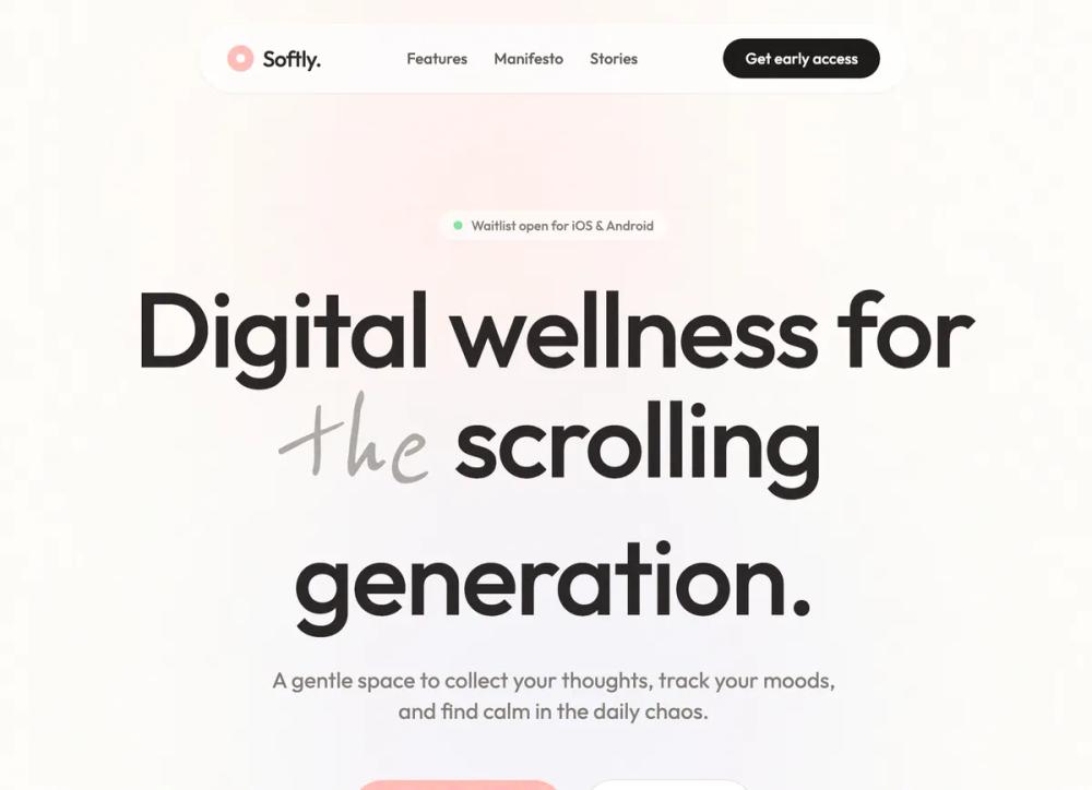 All Prompts
mobile appsass landingleads generationwaitlistwellness productlifestyle appstone graypeach blushstylelanding page
Softly - Digital Wellness App
UI Kit для мобильного приложения. Дизайн для wellness-брендов: медитация, дневник, лайфстайл. Спокойные цвета, текстуры, шрифты. Уменьшает когнитивную нагрузку.
by Shirley LouLive Preview
Prompt
# Softly - Digital Wellness App

{
  "summary": "Design a 'Softly' themed mobile-first landing page for a digital wellness app using a warm, desaturated pastel palette, high-end grain textures, and fluid, low-velocity animations. The UI should feel like a 'digital living room'—minimalist, tactile, and intentionally slow.",
  "style": {
    "description": "The style essence combines 'Digital Minimalism' with 'Gen-Z Lifestyle' aesthetics. Typography pairs the clean, rounded 'Outfit' sans-serif with the whimsical 'Reenie Beanie' cursive. The color story uses #292524 for soft-black text against a primary background of #FDFCF8. Visual depth is achieved through high-radius blurs on background blobs and a persistent 35% opacity SVG noise/grain overlay for a paper-like feel.",
    "prompt": "Create a visual style based on 'Digital Wellness'. \n- **Color Palette**: Background: #FDFCF8; Sage: #E8EFE8; Lavender: #EFEDF4; Peach/Coral: #FFB7B2 (Primary Accent); Dark Text: #292524; Muted Text: #78716C.\n- **Typography**: Primary font: 'Outfit' (Sans-serif), Headings at 48px-96px with tracking-tight (-0.025em), Sentence-case only. Accent font: 'Reenie Beanie' (Cursive) for expressive emphasis.\n- **Visual Effects**: 0.35 opacity fractal noise grain overlay. Border-radius: 2rem to 4rem for all containers. Soft shadows: 0 4px 20px -2px rgba(0,0,0,0.05).\n- **Animations**: Use 'reveal-on-scroll' (translateY: 30px to 0, opacity 0 to 1, duration 0.8s). Floating animations for background blobs (6s loop, translateY +/- 10px)."
  },
  "layout_and_structure": {
    "description": "A vertical, single-column flow designed for mobile-first consumption. It transitions from a spacious hero to interactive horizontal scrolls, ending in high-contrast (dark on light) conversion sections.",
    "prompts": [
      {
        "part": "Navigation",
        "prompt": "Floating pill-shaped nav bar: 70% white opacity, 20px backdrop-blur. Contains a small circular logo (Coral #FFB7B2 with white dot), text links in 14px Outfit Medium, and a dark stone (#292524) pill CTA button. Width should be constrained to 100% minus 32px on mobile."
      },
      {
        "part": "Hero Section",
        "prompt": "Center-aligned layout. Two large blurred background blobs (#FFE4E1 and #E6E6FA) at 60% opacity. Headline uses 72px Outfit with a handwritten cursive word inserted for emphasis. Sub-headline max-width 500px. Dual CTA buttons: primary pill in Coral #FFB7B2 with soft shadow, secondary pill in white with 1px stone-200 border."
      },
      {
        "part": "Horizontal Scenario Scroll",
        "prompt": "A list of cards that scroll horizontally. Each card: 288px width, 160px height, white background, rounded-3xl (24px). Top-left timestamp in 14px stone-400, bottom text in 20px stone-800. On hover, the text color should change to a pastel accent."
      },
      {
        "part": "App Experience Preview",
        "prompt": "A three-mockup stacked layout. Center phone is 300x620px, fully opaque, with a Coral (#FFB7B2) pulsing 'Breathe' button. Left and right phones are 280x580px, 80% opacity, slightly translated vertically (left +48px, right +96px) to create a cascading effect. Use Sage (#E8EFE8) and Lavender (#EFEDF4) for screen backgrounds."
      },
      {
        "part": "Diary Entry Testimonials",
        "prompt": "Two-column grid for desktop, single for mobile. Cards should have a slight rotation (+1 or -1 degree) to mimic physical notes. Background: White. Signature style: A 32px horizontal line followed by 'Reenie Beanie' cursive text in 24px stone-500."
      },
      {
        "part": "Waitlist Conversion",
        "prompt": "Full-width section with a central focus. Background uses high-blur floating gradients. Feature a dark stone #292524 rounded-square icon at the top with a coral dot. Form: Email input (rounded-full, bg-stone-50) and a black submit button that scales up on hover."
      }
    ]
  },
  "special_ui_components": [
    {
      "component": "Interactive FAQ Accordion",
      "description": "Smooth expanding/collapsing questions with icon rotation.",
      "prompt": "Container: white background, 16px rounded corners, 1px stone-100 border. Header: 24px padding, 500 weight text, 'plus' icon that rotates 45 degrees. Content: Transition from height 0 to auto using duration-500ms ease-in-out. Reveal text with bottom padding 24px."
    },
    {
      "component": "Grain Overlay",
      "description": "A global texture layer that makes the flat design feel analog.",
      "prompt": "A fixed div covering the viewport with z-index 50. Background-image uses an SVG filter with feTurbulence (baseFrequency 0.65). Mix-blend-mode: overlay. Opacity: 0.35. Pointer-events: none."
    }
  ]
}