All Prompts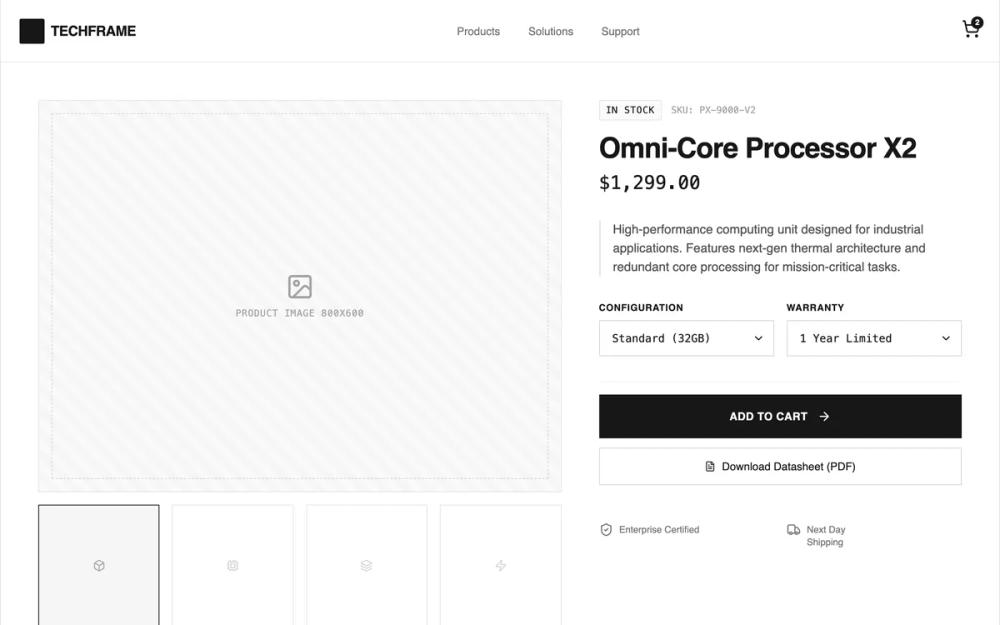 All Prompts
shopifylayoutecommerceproduct pagepdp
Specs-First Breakdown Product Page
Структурированная карточка товара с акцентом на таблицу характеристик. Идеальна для сравнения технических товаров в e-commerce.
by Shirley LouLive Preview
Prompt
# Specs-First Breakdown Product Page

{
  "summary": "A minimalist, blueprint-inspired design system using a rigid 1440px grid, heavy border-based containment, and a monochromatic 'schematic' aesthetic. It emphasizes technical hierarchy through monospaced numerical data and a strictly functional interface.",
  "style": {
    "description": "The style is defined by a 'Tech-Blueprint' aesthetic. It uses a primary typeface of General Sans for UI readability and JetBrains Mono for technical data and labels. The color palette is strictly neutral (#FFFFFF background, #171717 text, #E5E5E5 borders). Design elements use diagonal hatching patterns for placeholders and 1px solid borders to create a structural, wireframe feel without looking unfinished.",
    "prompt": "Create a design with a strict grayscale wireframe aesthetic. Background: #FFFFFF. Text: #171717 (Neutral-900). Borders: 1px solid #E5E5E5 (Neutral-200). Typography: Use 'General Sans' for headings and primary UI; use 'JetBrains Mono' at 12px-14px for technical specs, prices, and SKU identifiers. Placeholder elements must feature a diagonal stripe pattern using `repeating-linear-gradient(45deg, transparent, transparent 10px, #f5f5f5 10px, #f5f5f5 20px)`. Buttons: Primary is solid #171717 with white text; secondary is white with #E5E5E5 border. Micro-interactions: Use scale(0.99) for active button states and 0.3s cubic-bezier for hover transitions. Borders should be used to define all sections (border-b and border-r patterns)."
  },
  "layout_and_structure": {
    "description": "A top-down structured layout within a fixed max-width container (1440px) with explicit vertical border boundaries. Content is organized in high-density sections separated by horizontal lines.",
    "prompts": [
      {
        "part": "Sticky Header",
        "prompt": "Height: 80px. Background: #FFFFFF/95 with backdrop-blur. Layout: Left-aligned logo (square 32px block) and name; center-aligned nav links (14px font-weight 500); right-aligned cart icon with a circular badge. 1px bottom border."
      },
      {
        "part": "Product Hero Section",
        "prompt": "Two-column grid (7:5 ratio). Left column: Main image placeholder (4:3 aspect ratio) with a dashed inner border and diagonal stripe background. Below, a 4-column thumbnail grid. Right column: Vertical stack with 32px spacing. Includes breadcrumbs/status badges in mono font, 36px-48px bold heading, 24px mono price, and custom select dropdowns with no border-radius."
      },
      {
        "part": "Technical Specification Table",
        "prompt": "Full-width section. Title is 24px bold. Content is a vertical stack of rows. Each row: 4-column grid where the first column is a label (JetBrains Mono, 12px, uppercase, #737373) and the following three columns are the value (JetBrains Mono, 14px, #171717). Rows have border-bottom #E5E5E5 and background hover state #FAFAFA."
      },
      {
        "part": "Product Comparison Grid",
        "prompt": "Centrally aligned toggle switch in header. 3-column grid of cards. Cards: 1px border, 16px padding. Image placeholder is 3:2 ratio. Includes title, mono-font category tag, and a bottom-aligned price/action row with border-top separator."
      },
      {
        "part": "Accordion FAQ",
        "prompt": "Full-width stacked rows. Each item: 'details' element with 'summary' trigger. Hover state: #F9FAFB. Icons: 20px '+' icon that rotates 45 degrees on open. Content: 14px leading-relaxed text with 24px padding."
      }
    ]
  },
  "special_ui_components": [
    {
      "component": "Wireframe Placeholder",
      "description": "Functional image substitute with technical meta-data.",
      "prompt": "Rectangle with 1px solid border. Background: #F5F5F5 with a diagonal repeating stripe pattern. Center: A dashed inner stroke offset by 16px. Centered icon and 'JetBrains Mono' text indicating dimensions or file type."
    },
    {
      "component": "Segmented Control Toggle",
      "description": "A brutalist tab/toggle switcher.",
      "prompt": "A 2px padding container with #E5E5E5 border. Contains two buttons. The 'Active' button has #171717 background and white text. The 'Inactive' button has transparent background and #737373 text. 0px border-radius."
    }
  ],
  "special_notes": "MUST: Maintain perfect alignment with a 1px border grid. MUST: Use Monospace font for any and all numerical data (price, SKU, dimensions). MUST NOT: Use border-radius; all corners must be sharp 0px or very minimal 2px. MUST NOT: Use drop shadows except for very subtle hover effects on comparison cards."
}