All Prompts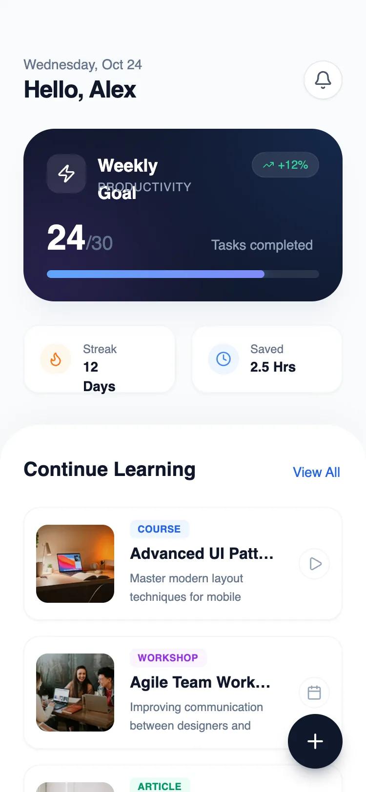 All Prompts
mobile applayouthome
Split Context Home
Двухзонный макет для мобильных приложений. Разделяет контекст пользователя (верх) и контент (низ) для трекеров привычек, фитнес-приложений, финансов и образования.
by Shirley LouLive Preview
Prompt
# Split Context Home

Create a mobile app home layout with two reusable, independent zones separated by spacing only:

TOP ZONE: A clean context/progress summary block showing user status or daily summary with icon, title, and progress indicator. Use soft gradients and rounded containers.

BOTTOM ZONE: A reusable content list/feed section with 3-4 card items. Each card should have image placeholder, title, description, and optional action. Cards use clean borders and subtle hover states.

Design system requirements:

- Zones must be visually independent and removable without breaking layout
- Use generous spacing (not visual separators) between zones
- Mobile-first design (375px width)
- Modern, minimalist aesthetic with refined typography
- Use semantic color tokens (primary, secondary, accent)
- Include proper mobile safe areas and padding
- Make cards reusable with consistent structure
- Add subtle micro-interactions (hover states, smooth transitions)

Here is a reference implementation:

~~~html
<!DOCTYPE html>
<html lang="en">
<head>
  <meta charset="UTF-8">
  <meta name="viewport" content="width=device-width, initial-scale=1.0">
  <title>Mobile Home Layout</title>
  <script src="https://cdn.tailwindcss.com"></script>
  <script src="https://code.iconify.design/iconify-icon/1.0.7/iconify-icon.min.js"></script>
  <link href="https://api.fontshare.com/v2/css?f[]=general-sans@400,500,600,700&display=swap" rel="stylesheet">
  <script>
    tailwind.config = {
      theme: {
        extend: {
          fontFamily: {
            sans: ['General Sans', 'sans-serif'],
          },
          colors: {
            primary: {
              50: '#eff4ff',
              100: '#dbeafe',
              500: '#3b82f6',
              600: '#2563eb',
              900: '#1e3a8a',
            },
            surface: '#F9FAFB',
          }
        }
      }
    }
  </script>
  <style>
    /* Hide scrollbar for Chrome, Safari and Opera */
    .no-scrollbar::-webkit-scrollbar {
      display: none;
    }
    /* Hide scrollbar for IE, Edge and Firefox */
    .no-scrollbar {
      -ms-overflow-style: none;  /* IE and Edge */
      scrollbar-width: none;  /* Firefox */
    }
  </style>
</head>
<body>
  <div class="w-full min-h-screen bg-surface flex flex-col font-sans text-slate-900">

    <!-- TOP ZONE: Context & Progress Summary -->
    <!-- Independent container: safe area top padding included -->
    <section class="shrink-0 w-full px-6 pt-14 pb-8 flex flex-col gap-6">

      <!-- Header Row (Part of Top Zone) -->
      <div class="flex justify-between items-center">
        <div class="flex flex-col">
          <span class="text-sm font-medium text-slate-500">Wednesday, Oct 24</span>
          <h1 class="text-2xl font-bold tracking-tight text-slate-900">Hello, Alex</h1>
        </div>
        <button class="w-10 h-10 rounded-full bg-white border border-slate-200 flex items-center justify-center text-slate-600 shadow-sm active:scale-95 transition-transform">
          <iconify-icon icon="lucide:bell" class="text-xl"></iconify-icon>
        </button>
      </div>

      <!-- Progress Summary Card -->
      <div class="relative w-full overflow-hidden bg-slate-900 rounded-[2rem] p-6 shadow-xl shadow-slate-200/50">
        <!-- Abstract decorative gradient background -->
        <div class="absolute top-0 right-0 w-64 h-64 bg-blue-500 rounded-full blur-[80px] opacity-20 -translate-y-1/2 translate-x-1/2"></div>
        <div class="absolute bottom-0 left-0 w-48 h-48 bg-purple-500 rounded-full blur-[60px] opacity-20 translate-y-1/3 -translate-x-1/3"></div>

        <div class="relative z-10 flex flex-col gap-6">
          <div class="flex justify-between items-start">
            <div class="flex items-center gap-3">
              <div class="w-10 h-10 rounded-xl bg-white/10 flex items-center justify-center backdrop-blur-md text-white">
                <iconify-icon icon="lucide:zap" class="text-xl"></iconify-icon>
              </div>
              <div>
                <h3 class="text-white font-semibold text-lg">Weekly Goal</h3>
                <p class="text-slate-400 text-xs font-medium uppercase tracking-wider">Productivity</p>
              </div>
            </div>
            <div class="flex items-center gap-1 bg-white/10 px-2.5 py-1 rounded-full backdrop-blur-sm border border-white/5">
              <iconify-icon icon="lucide:trending-up" class="text-emerald-400 text-xs"></iconify-icon>
              <span class="text-xs font-medium text-emerald-400">+12%</span>
            </div>
          </div>

          <div class="space-y-3">
            <div class="flex justify-between items-end text-white">
              <span class="text-4xl font-bold">24<span class="text-xl text-slate-500 font-medium">/30</span></span>
              <span class="text-sm font-medium text-slate-400 mb-1">Tasks completed</span>
            </div>

            <!-- Progress Bar -->
            <div class="h-2 w-full bg-white/10 rounded-full overflow-hidden">
              <div class="h-full bg-gradient-to-r from-blue-400 to-indigo-400 w-[80%] rounded-full shadow-[0_0_10px_rgba(59,130,246,0.5)]"></div>
            </div>
          </div>
        </div>
      </div>

      <!-- Quick Stats Row (Optional sub-zone) -->
      <div class="grid grid-cols-2 gap-4">
        <div class="bg-white p-4 rounded-2xl border border-slate-100 shadow-sm flex items-center gap-3">
          <div class="w-8 h-8 rounded-full bg-orange-50 flex items-center justify-center text-orange-500">
            <iconify-icon icon="lucide:flame"></iconify-icon>
          </div>
          <div class="flex flex-col">
            <span class="text-xs text-slate-500 font-medium">Streak</span>
            <span class="text-sm font-bold text-slate-900">12 Days</span>
          </div>
        </div>
        <div class="bg-white p-4 rounded-2xl border border-slate-100 shadow-sm flex items-center gap-3">
          <div class="w-8 h-8 rounded-full bg-blue-50 flex items-center justify-center text-blue-500">
            <iconify-icon icon="lucide:clock"></iconify-icon>
          </div>
          <div class="flex flex-col">
            <span class="text-xs text-slate-500 font-medium">Saved</span>
            <span class="text-sm font-bold text-slate-900">2.5 Hrs</span>
          </div>
        </div>
      </div>
    </section>

    <!-- BOTTOM ZONE: Reusable Content List -->
    <!-- Independent container: fills remaining space -->
    <section class="flex-1 w-full bg-white rounded-t-[2.5rem] shadow-[0_-10px_40px_-15px_rgba(0,0,0,0.05)] border-t border-slate-50 overflow-hidden flex flex-col">
      <div class="w-full px-6 pt-8 pb-[34px] overflow-y-auto no-scrollbar">

        <!-- Zone Header -->
        <div class="flex justify-between items-end mb-6">
          <h2 class="text-xl font-bold text-slate-900">Continue Learning</h2>
          <a href="#" id="view-all-link" class="text-sm font-medium text-blue-600 hover:text-blue-700 pb-0.5">View All</a>
        </div>

        <!-- Card List -->
        <div class="flex flex-col gap-4">

          <!-- Card 1 -->
          <article class="group relative w-full p-3 bg-white border border-slate-100 rounded-2xl shadow-sm hover:shadow-md hover:border-blue-100 transition-all duration-300 flex gap-4 items-center cursor-pointer">
            <div class="relative w-20 h-20 shrink-0 overflow-hidden rounded-xl bg-slate-100">
               <img src="https://images.unsplash.com/photo-1616400619175-5beda3a17896?q=80&w=200&auto=format&fit=crop" alt="Design System" class="w-full h-full object-cover group-hover:scale-110 transition-transform duration-500">
               <div class="absolute inset-0 bg-black/5"></div>
            </div>
            <div class="flex-1 min-w-0 pr-2">
              <div class="flex items-center gap-2 mb-1">
                <span class="text-[10px] font-bold tracking-wide uppercase text-blue-600 bg-blue-50 px-2 py-0.5 rounded-md">Course</span>
              </div>
              <h3 class="text-base font-bold text-slate-900 truncate mb-1">Advanced UI Patterns</h3>
              <p class="text-xs text-slate-500 line-clamp-2 leading-relaxed">Master modern layout techniques for mobile applications.</p>
            </div>
            <div class="shrink-0 self-center">
              <div class="w-8 h-8 rounded-full border border-slate-100 flex items-center justify-center text-slate-400 group-hover:bg-blue-600 group-hover:text-white group-hover:border-transparent transition-colors">
                <iconify-icon icon="lucide:play" class="ml-0.5"></iconify-icon>
              </div>
            </div>
          </article>

          <!-- Card 2 -->
          <article class="group relative w-full p-3 bg-white border border-slate-100 rounded-2xl shadow-sm hover:shadow-md hover:border-purple-100 transition-all duration-300 flex gap-4 items-center cursor-pointer">
            <div class="relative w-20 h-20 shrink-0 overflow-hidden rounded-xl bg-slate-100">
               <img src="https://images.unsplash.com/photo-1522202176988-66273c2fd55f?q=80&w=200&auto=format&fit=crop" alt="Team Workflow" class="w-full h-full object-cover group-hover:scale-110 transition-transform duration-500">
               <div class="absolute inset-0 bg-black/5"></div>
            </div>
            <div class="flex-1 min-w-0 pr-2">
              <div class="flex items-center gap-2 mb-1">
                <span class="text-[10px] font-bold tracking-wide uppercase text-purple-600 bg-purple-50 px-2 py-0.5 rounded-md">Workshop</span>
              </div>
              <h3 class="text-base font-bold text-slate-900 truncate mb-1">Agile Team Workflow</h3>
              <p class="text-xs text-slate-500 line-clamp-2 leading-relaxed">Improving communication between designers and developers.</p>
            </div>
            <div class="shrink-0 self-center">
              <div class="w-8 h-8 rounded-full border border-slate-100 flex items-center justify-center text-slate-400 group-hover:bg-purple-600 group-hover:text-white group-hover:border-transparent transition-colors">
                <iconify-icon icon="lucide:calendar" class=""></iconify-icon>
              </div>
            </div>
          </article>

          <!-- Card 3 -->
          <article class="group relative w-full p-3 bg-white border border-slate-100 rounded-2xl shadow-sm hover:shadow-md hover:border-emerald-100 transition-all duration-300 flex gap-4 items-center cursor-pointer">
            <div class="relative w-20 h-20 shrink-0 overflow-hidden rounded-xl bg-slate-100">
               <img src="https://images.unsplash.com/photo-1552664730-d307ca884978?q=80&w=200&auto=format&fit=crop" alt="Productivity" class="w-full h-full object-cover group-hover:scale-110 transition-transform duration-500">
               <div class="absolute inset-0 bg-black/5"></div>
            </div>
            <div class="flex-1 min-w-0 pr-2">
              <div class="flex items-center gap-2 mb-1">
                <span class="text-[10px] font-bold tracking-wide uppercase text-emerald-600 bg-emerald-50 px-2 py-0.5 rounded-md">Article</span>
              </div>
              <h3 class="text-base font-bold text-slate-900 truncate mb-1">Deep Work Principles</h3>
              <p class="text-xs text-slate-500 line-clamp-2 leading-relaxed">Strategies to maximize focus in a distracted world.</p>
            </div>
            <div class="shrink-0 self-center">
              <div class="w-8 h-8 rounded-full border border-slate-100 flex items-center justify-center text-slate-400 group-hover:bg-emerald-600 group-hover:text-white group-hover:border-transparent transition-colors">
                <iconify-icon icon="lucide:book-open" class=""></iconify-icon>
              </div>
            </div>
          </article>

          <!-- Card 4 -->
          <article class="group relative w-full p-3 bg-white border border-slate-100 rounded-2xl shadow-sm hover:shadow-md hover:border-orange-100 transition-all duration-300 flex gap-4 items-center cursor-pointer">
            <div class="relative w-20 h-20 shrink-0 overflow-hidden rounded-xl bg-slate-100">
               <img src="https://images.unsplash.com/photo-1517245386807-bb43f82c33c4?q=80&w=200&auto=format&fit=crop" alt="Interview" class="w-full h-full object-cover group-hover:scale-110 transition-transform duration-500">
               <div class="absolute inset-0 bg-black/5"></div>
            </div>
            <div class="flex-1 min-w-0 pr-2">
              <div class="flex items-center gap-2 mb-1">
                <span class="text-[10px] font-bold tracking-wide uppercase text-orange-600 bg-orange-50 px-2 py-0.5 rounded-md">Podcast</span>
              </div>
              <h3 class="text-base font-bold text-slate-900 truncate mb-1">Founder Stories #42</h3>
              <p class="text-xs text-slate-500 line-clamp-2 leading-relaxed">Interview with the creator of the popular meditation app.</p>
            </div>
            <div class="shrink-0 self-center">
              <div class="w-8 h-8 rounded-full border border-slate-100 flex items-center justify-center text-slate-400 group-hover:bg-orange-500 group-hover:text-white group-hover:border-transparent transition-colors">
                <iconify-icon icon="lucide:mic" class=""></iconify-icon>
              </div>
            </div>
          </article>

        </div>
      </div>
    </section>

    <!-- Floating Action Button (Optional Overlay) -->
    <button class="fixed right-6 bottom-6 w-14 h-14 bg-slate-900 text-white rounded-full shadow-lg shadow-slate-900/30 flex items-center justify-center hover:scale-105 active:scale-95 transition-transform z-50">
      <iconify-icon icon="lucide:plus" class="text-2xl"></iconify-icon>
    </button>

  </div>
</body>
</html>
~~~