All Prompts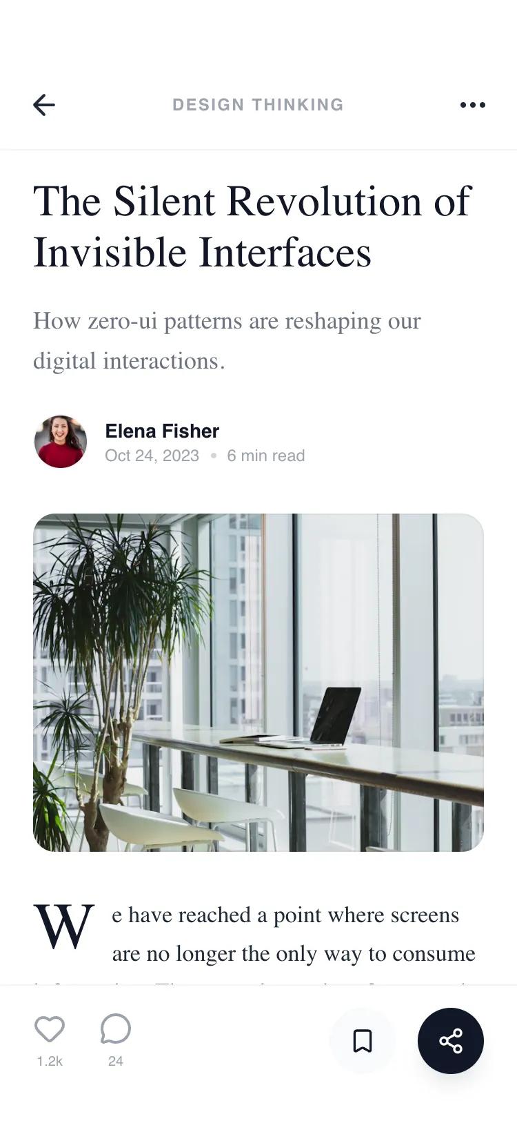 All Prompts
mobile appdetaillayout
Split Detail Page
Макет страницы с деталями контента для новостных платформ и блогов. Использует стекломорфизм, фиксированные панели и модульные секции. Идеально для мобильных приложений.
by Shirley LouLive Preview
Prompt
# Split Detail Page

{
  "summary": "A high-end editorial mobile design system for long-form content, prioritizing readability through serif typography and modular organization via collapsible sections and clean dividers.",
  "style": {
    "description": "The style is 'Minimalist Editorial.' It uses a monochrome foundation with subtle blue accents for utility tags. Typography pairs 'Lora' (Serif) for narrative elements and 'Satoshi' (Sans) for functional UI. Visual hierarchy is established through font weight and size rather than color. Components use #F3F4F6 for dividers and #F9FAFB for subtle background fills.",
    "prompt": "Create a minimalist mobile UI with a focus on editorial typography. Use 'Lora' for headings and body copy (weights 400-600) and 'Satoshi' for functional labels and meta-data (weights 400-700). Color Palette: White (#FFFFFF) background, Dark Gray (#111827) for primary text, Medium Gray (#6B7280) for secondary text, and light borders (#F3F4F6). Include a glassmorphism effect on the fixed header (backdrop-blur-md, bg-white/90). Use an 8px grid system for spacing. Buttons should be pill-shaped (rounded-full) with high-contrast states (solid #111827 vs subtle #F9FAFB). Implementation should focus on clean line-work, 1px borders, and 0px box shadows, except for a subtle lift on the share button (shadow-lg shadow-gray-200)."
  },
  "layout_and_structure": {
    "description": "A vertical, single-column scrollable layout (375px width) featuring a fixed top navigation, a content-driven hero, modular body sections, and a fixed utility footer.",
    "prompts": [
      {
        "part": "Fixed Navigation Header",
        "prompt": "Design a fixed header with 56px height. Background is bg-white/90 with backdrop-blur-md and a 1px border-bottom (#F3F4F6). Content: a left-aligned 'arrow-left' icon, a center-aligned uppercase category label (10px, bold, tracking-widest, #9CA3AF), and a right-aligned 'more-horizontal' icon."
      },
      {
        "part": "Hero & Meta Section",
        "prompt": "Layout starts at pt-32. Heading: Serif font, 32px, leading-[1.15], weight 500. Subtitle: Serif font, 18px, #6B7280. Author block: 40px circular avatar next to a 2-line info stack (Name: Satoshi bold 14px; Date/Read Time: 12px #9CA3AF with dot separator). Hero Image: 4:3 aspect ratio, 16px border-radius, #F9FAFB placeholder background."
      },
      {
        "part": "Editorial Body Section",
        "prompt": "Content area with 24px horizontal padding. Body text: Serif font, 17px, leading-relaxed, #1F2937. Include a Drop Cap: first letter of first paragraph should be 48px (5xl), serif, floating left. Blockquote: left-aligned with a 2px solid #111827 border-left, Lora Italic, 20px, with a Satoshi uppercase cite label (12px, tracking-wider)."
      },
      {
        "part": "Collapsible Modular Sections",
        "prompt": "Series of sections (Insights, Author, Related, Comments) separated by a 1px top border (#F3F4F6). Each header is a full-width button (padding 20px 24px) with uppercase labels (12px, bold, #9CA3AF) and a chevron icon. Contents expand below: Author section includes a 64px avatar and pill-shaped 'Follow' button. Stats section uses a 3-column grid with #F9FAFB cards."
      },
      {
        "part": "Fixed Utility Footer",
        "prompt": "Fixed bottom bar with safe-area padding (pb-34px, pt-4, px-6). Left side: Vertical stack icons for 'Like' and 'Comment' with numeric labels (10px). Right side: 48px circular buttons; one is bg-gray-50 for 'Bookmark', the other is bg-gray-900 (white icon) for 'Share' with a subtle shadow."
      }
    ]
  },
  "special_ui_components": [
    {
      "component": "Drop Cap Narrative Start",
      "description": "A stylized opening character for editorial sections.",
      "prompt": "Set the initial letter of the first paragraph to 5xl size, font-serif, leading-[0.8], margin-right: 12px, margin-top: 4px. Ensure the text wraps naturally around the character."
    },
    {
      "component": "Metric Insight Cards",
      "description": "A 3-column grid for article engagement stats.",
      "prompt": "Create three equal-width cards using bg-gray-50 and 12px border-radius. Center-align content: Large Serif value (24px, bold) on top, and a Satoshi uppercase label (10px, #9CA3AF) below."
    }
  ]
}