All Prompts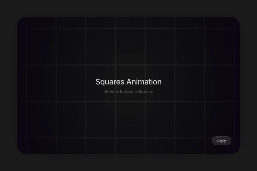 All Prompts
animationbackground
Squares Background
Анимированный фон из квадратов с направленным движением и эффектом при наведении. Настраиваемая скорость, цвет, направление. Для React.
by Zhou JasonLive Preview
Prompt
# Squares Background

You are given a task to integrate an existing React component in the codebase

~~~/README.md
# SquaresBackground

An animated grid background component consisting of moving squares. Supports directional movement, adjustable speed, customizable square sizes, and interactive hover effects.

## Dependencies
- `react`: ^18.x
- `lucide-react`: ^0.x

## Props

| Prop | Type | Default | Description |
|------|------|---------|-------------|
| `direction` | `'diagonal' \| 'up' \| 'right' \| 'down' \| 'left'` | `'right'` | The direction in which the grid squares move. |
| `speed` | `number` | `1` | The speed of the animation movement. |
| `borderColor` | `string` | `'#999'` | The stroke color for the square borders. |
| `squareSize` | `number` | `40` | The size of each square in pixels. |
| `hoverFillColor` | `string` | `'#222'` | The fill color of a square when it is hovered over. |

## Usage

```tsx
import { Squares } from '@/sd-components/2f6061b2-b0a8-4983-a973-36f6d0802fb9';

function MyPage() {
  return (
    <div style={{ width: '100%', height: '500px' }}>
      <Squares
        speed={0.5}
        squareSize={40}
        direction='diagonal'
        borderColor='#fff'
        hoverFillColor='#222'
      />
    </div>
  );
}
```
~~~

~~~/src/App.tsx
import React from 'react';
import { Squares } from './Component';

export default function App() {
  return (
    <div className="w-full h-screen bg-[#1A1A1B] overflow-hidden flex flex-col items-center justify-center p-20 relative">
      {/* Container with soft shadow for premium feel */}
      <div className="relative w-full h-full rounded-[40px] overflow-hidden shadow-[0_0_80px_rgba(0,0,0,0.2)] bg-black/20">
        <Squares
          speed={0.5}
          squareSize={40}
          direction="diagonal"
          borderColor="#333"
          hoverFillColor="#444"
        />

        {/* Title Overlay */}
        <div className="absolute inset-0 flex flex-col items-center justify-center pointer-events-none">
          <h1 className="text-white text-4xl font-medium tracking-tight mb-4 opacity-80 font-sans">
            Squares Animation
          </h1>
          <p className="text-white/40 text-sm font-normal tracking-wide">
            Minimalist Background Showcase
          </p>
        </div>

        {/* Reply Button Mockup */}
        <div className="absolute bottom-10 right-10">
          <button className="bg-white/10 hover:bg-white/20 text-white px-6 py-2 rounded-full backdrop-blur-md border border-white/10 transition-colors duration-300 pointer-events-auto">
            Reply
          </button>
        </div>
      </div>
    </div>
  );
}
~~~

~~~/package.json
{
  \"name\": \"@seedance/squares-background\",
  \"description\": \"Animated square grid background component\",
  \"dependencies\": {
    \"react\": \"^18.2.0\",
    \"react-dom\": \"^18.2.0\",
    \"lucide-react\": \"^0.344.0\"
  }
}
~~~

~~~/src/Component.tsx
/**
 * An animated grid background component consisting of moving squares.
 * Supports directional movement (up, down, left, right, diagonal), adjustable speed,
 * customizable square sizes, and interactive hover effects.
 */

import React, { useRef, useEffect } from 'react';

type CanvasStrokeStyle = string | CanvasGradient | CanvasPattern;

interface GridOffset {
  x: number;
  y: number;
}

export interface SquaresProps {
  /**
   * Direction of the grid movement
   * @default 'right'
   */
  direction?: 'diagonal' | 'up' | 'right' | 'down' | 'left';
  /**
   * Movement speed of the squares
   * @default 1
   */
  speed?: number;
  /**
   * Color of the square borders
   * @default '#999'
   */
  borderColor?: CanvasStrokeStyle;
  /**
   * Size of each individual square in pixels
   * @default 40
   */
  squareSize?: number;
  /**
   * Background color when a square is hovered
   * @default '#222'
   */
  hoverFillColor?: CanvasStrokeStyle;
}

export const Squares: React.FC<SquaresProps> = ({
  direction = 'right',
  speed = 1,
  borderColor = '#999',
  squareSize = 40,
  hoverFillColor = '#222'
}) => {
  const canvasRef = useRef<HTMLCanvasElement>(null);
  const requestRef = useRef<number | null>(null);
  const numSquaresX = useRef<number>(0);
  const numSquaresY = useRef<number>(0);
  const gridOffset = useRef<GridOffset>({ x: 0, y: 0 });
  const hoveredSquareRef = useRef<GridOffset | null>(null);

  useEffect(() => {
    const canvas = canvasRef.current;
    if (!canvas) return;
    const ctx = canvas.getContext('2d');
    if (!ctx) return;

    const resizeCanvas = () => {
      canvas.width = canvas.offsetWidth;
      canvas.height = canvas.offsetHeight;
      numSquaresX.current = Math.ceil(canvas.width / squareSize) + 1;
      numSquaresY.current = Math.ceil(canvas.height / squareSize) + 1;
    };

    window.addEventListener('resize', resizeCanvas);
    resizeCanvas();

    const drawGrid = () => {
      if (!ctx) return;
      ctx.clearRect(0, 0, canvas.width, canvas.height);

      const startX = Math.floor(gridOffset.current.x / squareSize) * squareSize;
      const startY = Math.floor(gridOffset.current.y / squareSize) * squareSize;

      ctx.lineWidth = 0.5;

      for (let x = startX; x < canvas.width + squareSize; x += squareSize) {
        for (let y = startY; y < canvas.height + squareSize; y += squareSize) {
          const squareX = x - (gridOffset.current.x % squareSize);
          const squareY = y - (gridOffset.current.y % squareSize);

          const gridX = Math.floor((x - startX) / squareSize);
          const gridY = Math.floor((y - startY) / squareSize);

          if (
            hoveredSquareRef.current &&
            gridX === hoveredSquareRef.current.x &&
            gridY === hoveredSquareRef.current.y
          ) {
            ctx.fillStyle = hoverFillColor;
            ctx.fillRect(squareX, squareY, squareSize, squareSize);
          }

          ctx.strokeStyle = borderColor;
          ctx.strokeRect(squareX, squareY, squareSize, squareSize);
        }
      }

      const gradient = ctx.createRadialGradient(
        canvas.width / 2,
        canvas.height / 2,
        0,
        canvas.width / 2,
        canvas.height / 2,
        Math.sqrt(Math.pow(canvas.width, 2) + Math.pow(canvas.height, 2)) / 2
      );
      gradient.addColorStop(0, 'rgba(0, 0, 0, 0)');
      gradient.addColorStop(1, 'rgba(6, 0, 16, 0.8)');
      ctx.fillStyle = gradient;
      ctx.fillRect(0, 0, canvas.width, canvas.height);
    };

    const updateAnimation = () => {
      const effectiveSpeed = Math.max(speed, 0.1);
      switch (direction) {
        case 'right':
          gridOffset.current.x = (gridOffset.current.x - effectiveSpeed + squareSize) % squareSize;
          break;
        case 'left':
          gridOffset.current.x = (gridOffset.current.x + effectiveSpeed + squareSize) % squareSize;
          break;
        case 'up':
          gridOffset.current.y = (gridOffset.current.y + effectiveSpeed + squareSize) % squareSize;
          break;
        case 'down':
          gridOffset.current.y = (gridOffset.current.y - effectiveSpeed + squareSize) % squareSize;
          break;
        case 'diagonal':
          gridOffset.current.x = (gridOffset.current.x - effectiveSpeed + squareSize) % squareSize;
          gridOffset.current.y = (gridOffset.current.y - effectiveSpeed + squareSize) % squareSize;
          break;
        default:
          break;
      }
      drawGrid();
      requestRef.current = requestAnimationFrame(updateAnimation);
    };

    const handleMouseMove = (event: MouseEvent) => {
      const rect = canvas.getBoundingClientRect();
      const mouseX = event.clientX - rect.left;
      const mouseY = event.clientY - rect.top;

      const hoveredSquareX = Math.floor((mouseX + (gridOffset.current.x % squareSize)) / squareSize);
      const hoveredSquareY = Math.floor((mouseY + (gridOffset.current.y % squareSize)) / squareSize);

      hoveredSquareRef.current = { x: hoveredSquareX, y: hoveredSquareY };
    };

    const handleMouseLeave = () => {
      hoveredSquareRef.current = null;
    };

    canvas.addEventListener('mousemove', handleMouseMove);
    canvas.addEventListener('mouseleave', handleMouseLeave);
    requestRef.current = requestAnimationFrame(updateAnimation);

    return () => {
      window.removeEventListener('resize', resizeCanvas);
      if (requestRef.current) cancelAnimationFrame(requestRef.current);
      canvas.removeEventListener('mousemove', handleMouseMove);
      canvas.removeEventListener('mouseleave', handleMouseLeave);
    };
  }, [direction, speed, borderColor, hoverFillColor, squareSize]);

  return (
    <canvas
      ref={canvasRef}
      className="w-full h-full border-none block bg-transparent"
    />
  );
};

export default Squares;
~~~

Implementation Guidelines

1. Analyze the component structure, styling, animation implementations
2. Review the component's arguments and state
3. Think through what is the best place to adopt this component/style into the design we are doing
4. Then adopt the component/design to our current system

Help me integrate this into my design