All Prompts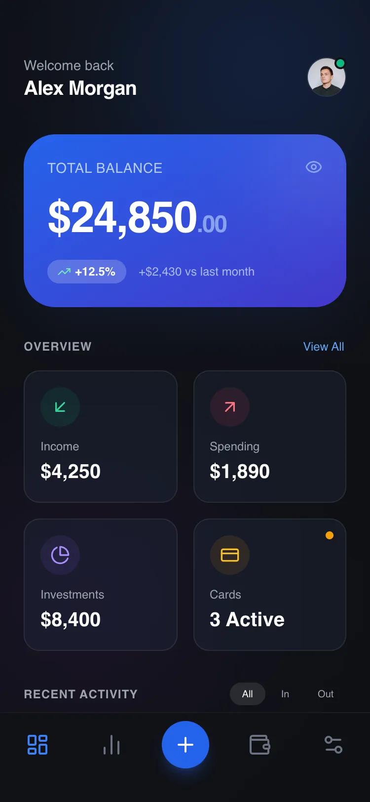 All Prompts
mobile apphomelayout
Summary-to-Detail Dashboard
Дашборд с иерархией: сводка -> метрики -> детали. Идеален для аналитики, финансов, SaaS. Показывает данные сверху вниз.
by Shirley LouLive Preview
Prompt
# Summary-to-Detail Dashboard

{
  "summary": "Create a sophisticated dark-themed mobile dashboard using a modular component system. The design features a high-impact primary summary card with a blue-indigo gradient, a responsive 2-column grid of glassmorphic metric cards, and a scrollable detail list for activity tracking. The interface relies on subtle depth, 12px backdrop blurs, and sharp typography to convey financial security and modern elegance.",
  "style": {
    "description": "The style is defined by a 'Glass-Dark' aesthetic. Primary font: General Sans (Semi-bold for headers, Medium for labels). Palette: Deep Charcoal (#0F1115) background, Primary Blue (#2563EB), and functional accents (Emerald #10B981, Rose #F43F5E, Amber #F59E0B). UI elements use 1px white/8% borders and 12px backdrop-filter blurs to create glass panels.",
    "prompt": "Apply a dark-mode theme with background #0F1115. Typography: Use 'General Sans' with letter-spacing -0.02em on headings. Primary colors: #2563EB (Primary Blue), #10B981 (Success), #F43F5E (Danger), #8B5CF6 (Accent). Global Card Styles: border-radius of 2rem (32px) for primary hero cards and 1rem (16px) for secondary cards. Glassmorphism: background: rgba(30, 41, 59, 0.4); backdrop-filter: blur(12px); border: 1px solid rgba(255, 255, 255, 0.08). Animations: Use cubic-bezier(0.4, 0, 0.2, 1) for transitions; active states should include a subtle scale down (0.98). Shadows: Soft blue-tinted shadows for primary elements (e.g., shadow-blue-900/20)."
  },
  "layout_and_structure": {
    "description": "A vertically stacked mobile layout consisting of a fixed header, a scrollable main content area with three distinct modular sections (Primary Hero, Secondary Grid, Detail List), and a fixed bottom navigation bar with a floating action button.",
    "prompts": [
      {
        "part": "Header",
        "prompt": "Top-aligned header with 56px height. Left side: Greeting text in gray-400 (sm) and user name in white (xl, semibold). Right side: 40px circular profile image with a 2px emerald green online indicator and 1px white/10% border."
      },
      {
        "part": "Primary Summary Section",
        "prompt": "Hero card with 32px corner radius and linear-gradient(to-bottom-right, #2563EB, #4338CA). Padding: 24px. Features a large metric (2.75rem font size) with a smaller decimal suffix. Include a 'percentage change' pill using white/20% background and 14px text. Top right: eye icon for visibility toggle."
      },
      {
        "part": "Metric Grid",
        "prompt": "A 2-column grid with 16px (1rem) spacing. Each card uses the 'Glassmorphism' style. Top of card: a 40px circular icon container with 10% opacity background of the icon color. Content: XS gray-400 label followed by XL semibold value. Cards should have an active state scale of 0.98."
      },
      {
        "part": "Activity List",
        "prompt": "Vertical list with 4px gap between items. Each item is a 12px rounded-corner row. Left side: 48px square icon with 16px radius (bg-white/5). Middle: Vertical stack with Title (sm, semibold) and Timestamp (xs, gray-500). Right side: Amount (sm, semibold). Row hover state: background rgba(255,255,255, 0.05)."
      },
      {
        "part": "Bottom Navigation",
        "prompt": "Fixed footer with backdrop-filter: blur(20px) and #0F1115/90 background. Contains 5 icons. Center icon is a 'Plus' FAB: 48px circle, #2563EB background, white icon, with a strong blue shadow. Other icons are 24px size, gray-500 default color, active state #2563EB."
      }
    ]
  },
  "special_ui_components": [
    {
      "component": "Glass Panel Metric Card",
      "description": "A reusable interactive card for secondary data visualization.",
      "prompt": "Construct a card with background `rgba(30, 41, 59, 0.4)`, `backdrop-filter: blur(12px)`, and `border: 1px solid rgba(255, 255, 255, 0.08)`. Border-radius: 16px. Padding: 16px. Include a hover/active state that scales the card to 0.98 and increases the brightness of the inner icon."
    },
    {
      "component": "Micro-Interaction Activity Row",
      "description": "A dense list item optimized for scannability and touch interaction.",
      "prompt": "Layout: Horizontal flexbox with `justify-between` and `items-center`. Icon container: 48px x 48px with `border-radius: 12px`. Title: `font-size: 14px`, `font-weight: 600`. Amount: `font-size: 14px`, `font-weight: 600`. Hover state triggers a background change to `white/5` and scales the internal icon by 1.05x using `transition: transform 0.2s ease`."
    }
  ],
  "special_notes": "MUST: Maintain a strict 24px (1.5rem) horizontal padding across all sections for consistent alignment. DO NOT use solid black (#000) for the background; use #0F1115 for depth. MUST: Use semantic icons (like Lucide) consistent in line weight (2px). MUST: Ensure 'modular' structure—each section must be wrapped in its own container to allow removal without impacting the layout of other modules."
}