All Prompts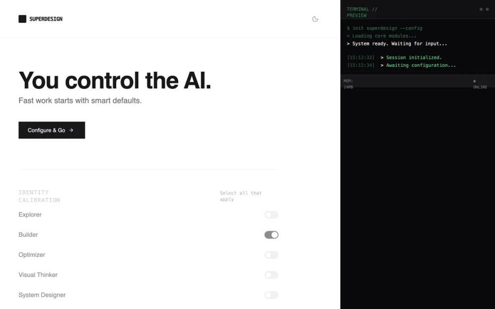 All Prompts
onboardingdeveloperhigh contrastminimalbrutalistzinc neutrallight modedark modeai productconfiguration wizardmonospace-accentspage
Superdesign Setup - Inline Preview
UI-компонент: интерфейс настройки с предпросмотром. Минималистичный дизайн для конфигурации ПО, SaaS, AI-инструментов. Функциональная ясность.
by Shirley LouLive Preview
Prompt
# Superdesign Setup - Inline Preview

{
  "summary": "A clean, technical configuration wizard with a single-column layout, featuring real-time feedback through an inline state preview panel. It uses a monochrome palette (Zinc/Gray) with emerald accents for status indicators.",
  "style": {
    "description": "The style is built on a 'Technical Minimalist' theme. It pairs Inter for legibility with JetBrains Mono for metadata and system updates. The color palette is strictly monochrome (Zinc 50 to 950) with a single accent color (Emerald #10b981) for 'Live' states. Components use sharp corners (rounded-sm) and subtle borders (#e4e4e7 / #27272a). Transitions are quick (150ms-200ms) to ensure a snappy, tool-like feel.",
    "prompt": "Create a design system using a Technical Minimalist aesthetic. \n- **Colors**: Background: #FFFFFF (Light) / #09090B (Dark). Text: #18181B (Light) / #F4F4F5 (Dark). Border: #F4F4F5 (Light) / #18181B (Dark). Accent: Emerald-500 (#10B981) for live indicators.\n- **Typography**: Headers and UI text: 'Inter', sans-serif. Monospace/Labels: 'JetBrains Mono', monospace. Sizes: H1: 64px bold, Subtitles: 20px, Section Headers: 14px uppercase with tracking-widest (0.1em), Body: 14px/16px.\n- **Borders/Corners**: Small radius (4px) or sharp corners. Border width: 1px.\n- **Animations**: Use 'cubic-bezier(0.4, 0, 0.2, 1)' for hover transitions. Include a 'ping' pulse for status dots (Emerald-400/500)."
  },
  "layout_and_structure": {
    "description": "A focused single-column layout (max-width: 768px) centered on the page. The flow is linear, starting with a bold hero and ending with a status-driven action footer.",
    "prompts": [
      {
        "part": "Header",
        "prompt": "Sticky header with 90% opacity and backdrop-blur-sm. Elements: Left-aligned logo (20px square block next to 'Superdesign' in JetBrains Mono bold). Right-aligned theme toggle using Lucide icons (Sun/Moon)."
      },
      {
        "part": "Hero Section",
        "prompt": "Large H1 'You control the AI.' (Inter, 64px, bold, tracking-tight). 20px font-medium subtext. Primary action button: Zinc-900 (Light) / White (Dark) with right-arrow icon, hover effect: scale-[0.98] on click."
      },
      {
        "part": "Configuration Sections",
        "prompt": "Each section starts with a JetBrains Mono header (14px, uppercase, tracking-widest, Zinc-400). Use a vertical spacing of 64px between sections. Use 50% opacity for inactive sections, becoming 100% on hover/focus."
      },
      {
        "part": "State Preview Panel",
        "prompt": "A compact section (rounded-md, background Zinc-50/900). Top bar includes 'STATE PREVIEW' text and a 'Live' pulsing Emerald dot. Content area is a scrollable list of 4 lines max, each line prefixed with a grayed-out timestamp (HH:MM:SS) followed by the system event text in JetBrains Mono."
      },
      {
        "part": "Completion Footer",
        "prompt": "A two-column stats grid (e.g., '2.4s Avg Boot Time') using bold mono values and 10px uppercase labels. Primary CTA button: Full-width on mobile, auto-width on desktop, high contrast (Zinc-900 or White)."
      }
    ]
  },
  "special_ui_components": [
    {
      "component": "Inline State Stream",
      "description": "A terminal-lite log panel for real-time user feedback.",
      "prompt": "Container: background: #f9f9f9 (light) / #121212 (dark); padding: 16px; border: 1px solid #e4e4e7; font-family: 'JetBrains Mono'; font-size: 12px. Logic: When a user interacts with a toggle or slider, a new line prepends the log with a timestamp (color: #a1a1aa). Only show the most recent 4 lines; older lines fade out or are removed via 'animate-in fade-in slide-in-from-bottom-1'."
    },
    {
      "component": "Intervention Threshold Slider",
      "description": "A custom range input for selection granular control.",
      "prompt": "Track: height: 4px; background: #e4e4e7 (light) / #27272a (dark). Thumb: 16px diameter circle; background: CurrentColor; border: 4px solid white (light) / #18181b (dark). Labels: Four fixed points below (Silent, Suggest, Auto-complete, Take over) in 10px JetBrains Mono."
    },
    {
      "component": "DNA Segmented Controls",
      "description": "Horizontal button groups for mode selection.",
      "prompt": "Container: background #f4f4f5 (light) / #18181b (dark); padding: 4px; border-radius: 4px. Active State: white background (light) / #27272a (dark); shadow-sm; text-zinc-900. Inactive: text-zinc-500; no background."
    }
  ],
  "special_notes": "MUST: Maintain strict 3-4 line limit for the Inline Preview to prevent layout shift. MUST NOT: Use vibrant colors or rounded 'pill' shapes; keep it boxy and technical. MUST: Use monospace for all system outputs and labels to reinforce the 'workspace DNA' concept."
}