All Prompts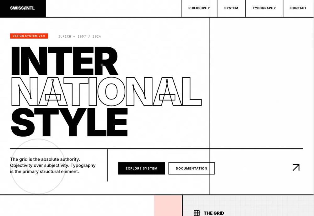 All Prompts
style
Swiss Style
Стиль Швейцарский - типографический дизайн, основанный на сетке, асимметрии и читаемости. Идеален для чистого и функционального UI.
by Zhou JasonLive Preview
Prompt
# Swiss Style

<design-system>

# Design Style: Swiss International (International Typographic Style)

## Design Philosophy

**The International Typographic Style (Swiss Style)** is not merely a visual trend; it is a philosophy of objective communication born in 1950s Switzerland. It rejects personal expression and subjectivity in favor of universal clarity, mathematical precision, and logical structure.

**Core Tenets:**

1. **Objectivity over Subjectivity**: The design must recede to let the content speak. Every visual decision must be justifiable by the content's needs. Personal ornamentation is eliminated in favor of functional communication. The designer is not an artist expressing themselves, but a conduit for information.

2. **The Grid as Law**: The grid is the absolute authority. It is not a guideline; it is the visible skeleton of the information. We generally avoid static center-alignment in favor of **asymmetrical organization** to create dynamic visual rhythm and tension. Grid patterns are made visible through subtle background textures.

3. **Typography is the Interface**: Type is not just for reading; it is the primary structural and graphical element. We use grotesque sans-serif typefaces (Inter, Helvetica) because they are neutral vessels for meaning. Scale, weight, and position are the only tools needed to create hierarchy.

4. **Active Negative Space**: White space is not "empty"; it is an active structural element. It defines boundaries, gives weight to the massive typography, and creates breathing room for the intellect.

5. **Layered Texture & Depth**: While maintaining flatness (no shadows or 3D effects), we achieve visual depth through **subtle pattern overlays**: grid lines (24px), dot matrices (16px), diagonal stripes, and noise textures. These patterns add tactile richness without compromising the objective aesthetic.

6. **Universal Intelligibility**: The design should be understood instantly. It is clean, legible, and undeniably modern.

**The Vibe**:

- **Intellectual & Architectural**: The page should feel like a well-engineered building, a museum exhibition, or a transit map—functional, safe, and efficient.

- **Structured yet Organic**: While brutally honest in its geometry, subtle texture patterns provide warmth and visual interest—like fine paper grain or screen printing texture.

- **Brutally Precise**: No gradients to hide bad layout. Depth comes from pattern, not shadow. The design is flat yet rich, stark yet nuanced.

- **Timeless**: By avoiding ephemeral trends (glassmorphism, neumorphism, soft rounded corners), the design aims for permanence.

**Visual Signatures**:

- **Flush-Left, Ragged-Right Text**: Text blocks are strictly left-aligned to the grid.

- **Grotesque Sans-Serif**: Neutral, objective fonts with high x-heights (Inter, weight 400-900).

- **Mathematical Scales**: Font sizes that relate to each other through clear ratios (responsive scaling from mobile to desktop).

- **The "Swiss Red" (#FF3000)**: Used not as decoration, but as a functional signal—a stop sign, a warning, a highlight—piercing the monochrome calm.

- **Pattern-Based Texture**: Subtle CSS-generated patterns (grid, dots, diagonals, noise) applied to background surfaces for visual depth without breaking flatness.

- **Geometric Abstraction**: Basic shapes (circles, squares, rectangles, lines) arranged in Bauhaus-inspired compositions.

## Design Token System (The DNA)

### Colors (Strict Palette)

- **Background**: `#FFFFFF` (Pure White) - The canvas must be neutral.

- **Foreground**: `#000000` (Pure Black) - Text is absolute.

- **Muted**: `#F2F2F2` (Light Gray) - Used for secondary backgrounds to create rhythm.

- **Accent**: `#FF3000` (Swiss Red) - The **only** signal color. Used sparingly for CTAs and critical emphasis.

- **Border**: `#000000` (Pure Black) - Structure is visible.

### Typography

- **Font Family**: `Inter` (Google Font). Ideally closest to Helvetica/Akzidenz-Grotesk.

- **Weights**: Heavy use of **Black (900)** and **Bold (700)** for headings. **Regular (400)** or **Medium (500)** for body.

- **Style**: **UPPERCASE** for almost all headings and labels.

- **Tracking**: `tracking-tighter` for large headlines, `tracking-widest` for small labels.

- **Scale**: Extreme contrast. Headlines should be massive `text-7xl` to `text-9xl`+). Body text is legible and objective.

### Radius & Border

- **Radius**: `0px` (Strictly Rectangular). No rounded corners.

- **Borders**: Thick, visible borders `border-2` or `border-4`). Used to define the grid.

### Shadows & Effects

- **Shadows**: No drop shadows. The design maintains flatness. Only use subtle ring shadows for compositional geometry (e.g., `shadow-[0_0_0_8px_rgba(255,48,0,0.1)]` for accent circles).

- **Effects**: Interactive elements use simple color inversion (Black → White, White → Red), scale transforms (1.0 → 1.05), rotation (0deg → 90deg for plus icons), and vertical translation (-1px lift on hover).

### Textures & Patterns (Critical for Depth)

These CSS-based patterns add visual richness while maintaining the flat, objective aesthetic:

- **Grid Pattern** `.swiss-grid-pattern`):

~~~
- Subtle 24×24px grid lines at 3% opacity

- Applied to hero composition area, blog sidebar, muted backgrounds

- Creates visible structure without overwhelming content
~~~

- **Dot Matrix** `.swiss-dots`):

~~~
- Radial gradient dots, 16×16px spacing, 4% opacity

- Applied to section headers, feature sidebars

- Evokes traditional print techniques
~~~

- **Diagonal Lines** `.swiss-diagonal`):

~~~
- 45-degree repeating lines, 10px spacing, 2% opacity

- Applied to benefits sidebar, accent backgrounds

- Adds directional energy to static layouts
~~~

- **Noise Texture** `.swiss-noise`):

~~~
- Fractal noise overlay via SVG filter, 1.5% opacity

- Applied globally to body background

- Simulates paper texture, adds warmth to stark white backgrounds
~~~

**Application Strategy**: Use patterns on muted gray backgrounds `#F2F2F2`) and occasionally on white surfaces. Never apply patterns to pure black backgrounds or red accent areas. Patterns should enhance, not dominate.

## Component Stylings

### Buttons

- **Shape**: Strictly rectangular `rounded-none`).

- **Style**: Solid Black background with White text (Primary). White background with Black border (Secondary).

- **Hover**: Invert colors or switch to Swiss Red `#FF3000`).

- **Typography**: Uppercase, bold, tracking-wide.

### Cards / Containers

- **Structure**: Defined by their borders `border-black`).

- **Background**: White or Muted Gray `#F2F2F2`).

- **Padding**: Generous and uniform `p-8`, `p-12`).

- **Hover**: Entire card background changes color (e.g., to Swiss Red or Black) with text color inversion.

### Inputs

- **Style**: Underlined `border-b`) or solid rectangular box with thick border.

- **Focus**: Sharp change in border color to Swiss Red. No glow rings.

## Layout Strategy

- **The Grid**: The grid is God. It should often be **visible** (using borders on elements).

- **Asymmetry**: Embrace asymmetrical balance. A large photo on the left balanced by negative space and small text on the right.

- **Alignment**: Strict left alignment for text.

- **Separators**: Use horizontal and vertical lines to divide sections.

## Non-Genericness (The "Bold" Factor)

This implementation goes beyond "generic Swiss style" by incorporating:

- **Massive Responsive Typography**: Headlines scale from `text-6xl` (mobile) to `text-[10rem]` (desktop). Let words be images.

- **Visible Structure**: The layout grid is made tangible through:

~~~
- Thick 4px black borders defining sections

- Visible grid patterns (24px) on backgrounds

- Asymmetric column ratios (8:4, 7:5, 5:7) creating dynamic tension
~~~

- **Numbered Section Labels**: Every major section has a prefix (01. System, 02. Method, 03. Advantages, 04. Journal) in red accent with uppercase tracking

- **Layered Geometric Compositions**:

~~~
- Hero features abstract Bauhaus-style composition with overlapping shapes

- Product detail uses 2×2 grid of geometric elements with different texture patterns

- Each composition combines circles, rectangles, lines in purposeful arrangement
~~~

- **Pattern-Based Texture**: Four distinct CSS patterns (grid, dots, diagonal, noise) applied strategically to create depth without shadows

- **Bold Interaction States**:

~~~
- Full color inversions (not just opacity fades)

- Rotating icons (plus signs spin 90°)

- Scale transforms on hover

- Vertical slide animations in navigation
~~~

- **Active Negative Space**: Generous padding (p-12, p-24) and asymmetric layouts create breathing room and visual tension

- **Functional Color System**: Red is used only for:

~~~
- Primary CTAs and accents

- Hover states as visual feedback

- Section number prefixes

- Never as decorative fill
~~~

## Spacing & Iconography

- **Spacing**: High density in information clusters (tables), but high spaciousness in narrative sections.

- **Iconography**: Use `lucide-react` icons, but treat them as functional symbols. Stroke width should match typography. Often enclosed in geometric shapes (squares/circles).

## Animation

- **Feel**: Instant, mechanical, snappy, precise. Movement is purposeful and geometric.

- **Transitions**: `duration-200 ease-out` or `duration-150 ease-linear` for rapid feedback. No elastic or spring animations.

- **Micro-interactions**:

~~~
- **Navigation Links**: Vertical slide animation with color change (text slides up, red replacement slides in from below)

- **Stats Cards**: Scale transform on numbers (1.0 → 1.05), rotating plus icons (0° → 90°), background color snap (black → red)

- **Feature Cards**: Color inversion on hover (white → accent red), arrow rotation (-45° → 0°)

- **Testimonials**: Subtle upward lift (-1px translateY), border color change (black → red), quote text color change

- **FAQ Cards**: Rotating plus icons, full background color inversion (white → red)

- **Buttons**: Instant background color changes, no scale transforms
~~~

- **Hover States**: Always indicate interactivity through color, scale, or position changes—never subtle fades. Swiss style is bold and immediate.

## Responsive Strategy

The Swiss style must maintain its bold character across all screen sizes:

**Mobile (< 768px)**:

- Typography scales down but remains bold: `text-6xl` for hero headlines

- Single column layouts with vertical stacking

- Borders remain 4px thick (never thin out)

- CTAs become full-width buttons with consistent height `h-16`)

- Grid patterns and textures maintain same opacity/scale

- Stats become 2×2 grid instead of 1×4

- Navigation collapses (visible only on desktop)

**Tablet (768px - 1024px)**:

- Two-column layouts for testimonials, FAQ, features

- Typography scales to `text-8xl` for headlines

- Asymmetric grids start to appear

- Touch targets remain minimum 44×44px

**Desktop (1024px+)**:

- Full asymmetric grid layouts (8:4, 7:5, 5:7 ratios)

- Maximum typography scale `text-9xl`, `text-[10rem]`)

- Multi-column layouts (3-4 columns for blog, footer)

- Sticky positioning for section headers

- All hover states and micro-interactions active

**Key Principles**:

- Never compromise on border thickness or contrast

- Maintain uppercase typography and tight tracking

- Patterns remain visible at all breakpoints

- Red accent color used consistently across devices

- Spacing remains generous (reduce from p-24 to p-12 on mobile, but never less)

## Accessibility

- **Contrast**: The Black/White/Red scheme naturally offers ultra-high contrast (21:1 for black/white). Ensure red text on white meets AA standards.

- **Focus**: High-contrast 2px ring in red `focus-visible:ring-2 focus-visible:ring-swiss-accent focus-visible:ring-offset-2`)

- **Touch Targets**: All interactive elements minimum 44×44px on mobile

- **Motion**: All animations are CSS-based and respect `prefers-reduced-motion`

- **Semantics**: Proper heading hierarchy, semantic HTML5 elements, ARIA labels where needed

</design-system>