Загрузка...
UI-кит для аудиоредактора и SaaS-дашборда. Профессиональный дизайн с типографикой Montserrat, градиентами и SVG-элементами. Идеален для медиа, финтеха, креатива.
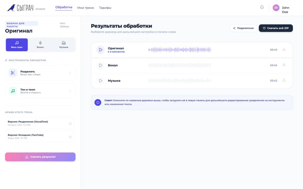
# Сыграч — Обновленный редактор v5.0

{
  "summary": "A modern, professional audio studio interface focusing on track management and processing results. It utilizes a three-column logic: navigation header, tool/archive sidebar, and a central results area featuring minimalist waveform visualizers.",
  "style": {
    "description": "Professional 'Studio' aesthetic using Montserrat font (weights 300-800). Color scheme relies on a light slate background (#f8fafc), white cards, and a specific brand gradient (linear-gradient(135deg, #ff80b5 0%, #9089fc 100%)). UI accents use Indigo (#4f46e5) and Emerald (#10b981). Animations are snappy (0.2s) using standard ease-in-out curves for hover and selection states.",
    "prompt": "Set the base font family to 'Montserrat', sans-serif. Background should be #f8fafc. Define primary text as #1e293b (Slate 800) and secondary text as #64748b (Slate 500). Create a 'brand-gradient' using linear-gradient(135deg, #ff80b5 0%, #9089fc 100%). Use border-radius: 1rem (16px) for tools and 1.5rem (24px) for major containers. Interactive elements must have transition: all 0.2s cubic-bezier(0.4, 0, 0.2, 1). Waveform visualizers should consist of 1px wide vertical bars (color #cbd5e1) with a 1.5px gap, scaling to #9089fc when active. All uppercase labels must have font-size: 10px, font-weight: 700, and tracking: 0.1em."
  },
  "layout_and_structure": {
    "description": "The layout is a full-height, flexbox-based dashboard with a sticky header (h-72px approx), a fixed-width left sidebar (384px), and a scrollable main content area. Components are separated by subtle #e2e8f0 borders.",
    "prompts": [
      {
        "part": "Header",
        "prompt": "Create a white background header (#FFFFFF) with a thin bottom border (#e2e8f0). Include a logo (height 36px) followed by a 'STUDIO' label in 10px uppercase bold tracking-widest. Center a horizontal nav with 24px gaps. Right-align a notification bell icon and a user profile section featuring a 32px circular avatar with the brand-gradient and initials in white text."
      },
      {
        "part": "Left Sidebar - Track Selection",
        "prompt": "Width 384px, white background, right-border #e2e8f0. Top section features a 10px uppercase badge in indigo (#4f46e5) on light indigo (#eef2ff). Below it, a 24px bold H2 title. Implement a 3-column button grid (segmented control style) with a light slate background (#f1f5f9). Buttons should be 12px font-weight 700, centering an icon above text; active button should be indigo (#4f46e5) with white text."
      },
      {
        "part": "Left Sidebar - Tool Cards",
        "prompt": "Stacked vertical buttons for processing. Each card should have 16px padding, a 1px border (#f1f5f9), and a 40px square icon container with rounded corners (12px). Hover state triggers a shadow-md and indigo border. Text includes a 12px bold title and 10px secondary description."
      },
      {
        "part": "Track Results Panel",
        "prompt": "Main area with 32px padding on #f8fafc background. Title section should have a 24px extrabold heading and two action buttons: one white with border, one solid #1e293b with shadow. Results list is a white card container with 24px rounded corners and internal rows separated by 1px borders (#f1f5f9). Each row is 72px high, containing a play button (40px circle), title/status column, a flexible waveform area, a time label (12px), and a download icon."
      },
      {
        "part": "Archive Section",
        "prompt": "Inside the sidebar bottom, a scrollable list of compact rows. Each row has 12px padding, a 1px border (#f1f5f9), and displays a title (11px bold) and metadata (9px light gray) including date and size. Include a small download icon on the right that changes color on row hover."
      }
    ]
  },
  "special_ui_components": [
    {
      "component": "Minimalist Waveform Visualizer",
      "description": "A high-density bar chart used for audio tracks.",
      "prompt": "A flex container with align-items: center and gap: 1.5px. Inside, generate 120+ div elements ('bars') with width: 1px and background-color: #cbd5e1. Heights should be randomized between 20% and 100% of the 24px container height. When the parent row is '.active', bars should transition background-color to #9089fc."
    },
    {
      "component": "Brand Gradient Avatar",
      "description": "Circular avatar for user profiles or branding.",
      "prompt": "A 32px x 32px circle with background: linear-gradient(135deg, #ff80b5 0%, #9089fc 100%). Text inside should be white, 12px bold, perfectly centered. Border-radius must be 50%."
    }
  ],
  "special_notes": "MUST maintain the 1px width for waveform bars to ensure 'thin wave' aesthetic. MUST NOT use drop shadows on the main results container; keep it flat with a subtle border. MUST use the specific 10px uppercase bold tracking for all metadata labels to preserve the studio feel. DO use 1.5px gaps between waveform bars."
}