All Prompts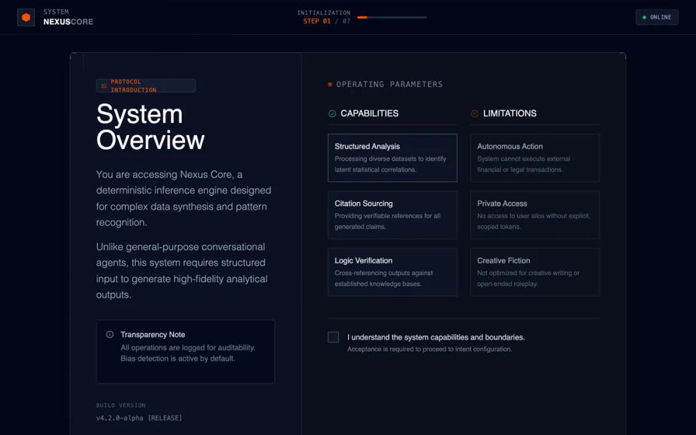 All Prompts
onboardingpagedark modehigh contrastmultistep workflowsassai productslate colourblackorange accentresearch toolenterprise software
Technical System Onboarding
Дизайн UI-системы онбординга для AI, Data Science, Fintech. Темная тема, контрастные акценты, модульная структура. Повышает прозрачность и контроль.
by Shirley LouLive Preview
Prompt
# Technical System Onboarding

{
  "summary": "A serious, enterprise-grade technical onboarding flow for complex AI or data systems. It utilizes a layered dark-mode interface with a rigid grid system, technical framing elements, and a high-contrast 'Signal Orange' accent color for primary actions. The layout is split between descriptive high-level overviews and granular 'Can/Cannot' matrices to establish system trust and boundaries.",
  "style": {
    "description": "Industrial/technical theme with a heavy emphasis on typography hierarchy. Primary font is Space Grotesk for geometric display headers, Inter for readable sans-serif body text, and JetBrains Mono for system-level metadata. Color palette is dominated by Slate-950 (#020617) backgrounds with accent color Signal Orange (#FF4F00). Animations are minimal and functional, utilizing cubic-bezier curves for 'slide-up' and 'fade-in' transitions.",
    "prompt": "### Visual Language & Style Guide\n\n**1. Colors:**\n- **Primary Background:** Slate-950 (#020617)\n- **Secondary Panels:** Slate-925 (#0a0f1c) and Slate-900 (#0f172a)\n- **Primary Accent (CTA):** Signal Orange (#FF4F00), Hover: #FF6A26\n- **Borders/Dividers:** Slate-800 (#1e293b) at 60% opacity\n- **Status Colors:** Online: Emerald-500; Warning/Limit: Deep Orange-900\n\n**2. Typography:**\n- **Display/Headers:** 'Space Grotesk', Medium (500) or Bold (700). Characterized by geometric shapes. \n- **Body Text:** 'Inter', Light (300) or Regular (400). Line height: 1.625.\n- **Technical Metadata:** 'JetBrains Mono', Regular (400). Used for versions, step counts, and system status.\n\n**3. Effects & UI Elements:**\n- **Grid Background:** 40px x 40px grid pattern in Slate-800, opacity 7%, with a radial mask fade.\n- **Borders:** 1px solid Slate-800. Use 'Tech Borders' (simulated by L-shaped corner strokes) in Slate-600 to frame containers.\n- **Buttons:** Sharp corners or very subtle 2px radius. High contrast text (White on Signal Orange).\n- **Animations:** Fade-in (0.6s, cubic-bezier(0.16, 1, 0.3, 1)) and Slide-up (0.5s, translateY(10px))."
  },
  "layout_and_structure": {
    "description": "The interface follows a 'Locked Terminal' layout with a fixed header and footer, and a scrolling central content panel. The main interaction area is a centered 12-column grid container with a 5/7 ratio split between high-level description and technical parameters.",
    "prompts": [
      {
        "part": "System Header",
        "prompt": "A fixed 64px (h-16) header with a Slate-950 background and 60% opacity backdrop blur. Left side features a small 32px square system icon (hexagon) and dual-line text: 'SYSTEM' (Mono, 10px) and 'PRODUCT NAME' (Display, 14px). Center-right contains a 128px horizontal progress bar in Slate-800 with a glowing Signal Orange fill representing step completion. Right side shows a pulse-animated 'Online' status indicator with a green dot."
      },
      {
        "part": "Central Narrative Panel",
        "prompt": "A 12-column grid layout inside a container with a maximum width of 1024px. \n- **Left Column (5 Cols):** 'Intro Section'. Large display header (48px-64px), descriptive body text (18px), and a boxed 'Transparency Note' using a Slate-950 background and info icon.\n- **Right Column (7 Cols):** 'Technical Parameters'. Separated by a 1px Slate-800 vertical divider. Contains two sub-columns for 'Capabilities' and 'Limitations'. Each list item is a 3-line card (title + description) with a 1px border that shifts from Slate-800 to Slate-600 on hover."
      },
      {
        "part": "Control Footer",
        "prompt": "A fixed 80px (h-20) footer. Left side has a 'Back' button using monospace text and a simple arrow icon. Right side features a 'Press Enter to Continue' micro-copy (hidden on mobile) and the primary 'Signal Orange' CTA button. The button must include a subtle white shimmer animation effect that travels across the surface every few seconds."
      }
    ]
  },
  "special_ui_components": [
    {
      "component": "Signal CTA Button",
      "description": "A high-visibility primary action button with an internal shimmer effect.",
      "prompt": "Rectangle button; background: #FF4F00; color: #FFFFFF; font-family: Inter; font-weight: 500; font-size: 14px; letter-spacing: 0.05em; padding: 12px 32px; transition: transform 0.2s; Includes a span with absolute positioning and an overflow-hidden parent that runs a 1.5s linear shimmer animation using a white-transparent-white gradient at a 45-degree angle."
    },
    {
      "component": "Capabilities Matrix Card",
      "description": "A technical listing card for system parameters.",
      "prompt": "Border: 1px solid #1e293b; background: rgba(15, 23, 42, 0.5); padding: 12px; transition: border-color 0.2s ease; Hover-state: border-color #475569; Internal Title: Text-slate-200, font-weight 500, size 14px; Internal Description: Text-slate-500, size 12px, line-height 1.5."
    }
  ],
  "special_notes": "MUST maintain high information density without clutter. MUST avoid all 'soft' design elements like large border radii, pastel gradients, or playful emojis. MUST ensure all technical metadata (v4.2.0, STEP 01) is set in monospace. DO NOT use glowing text effects except for the small step-indicator bar."
}