All Prompts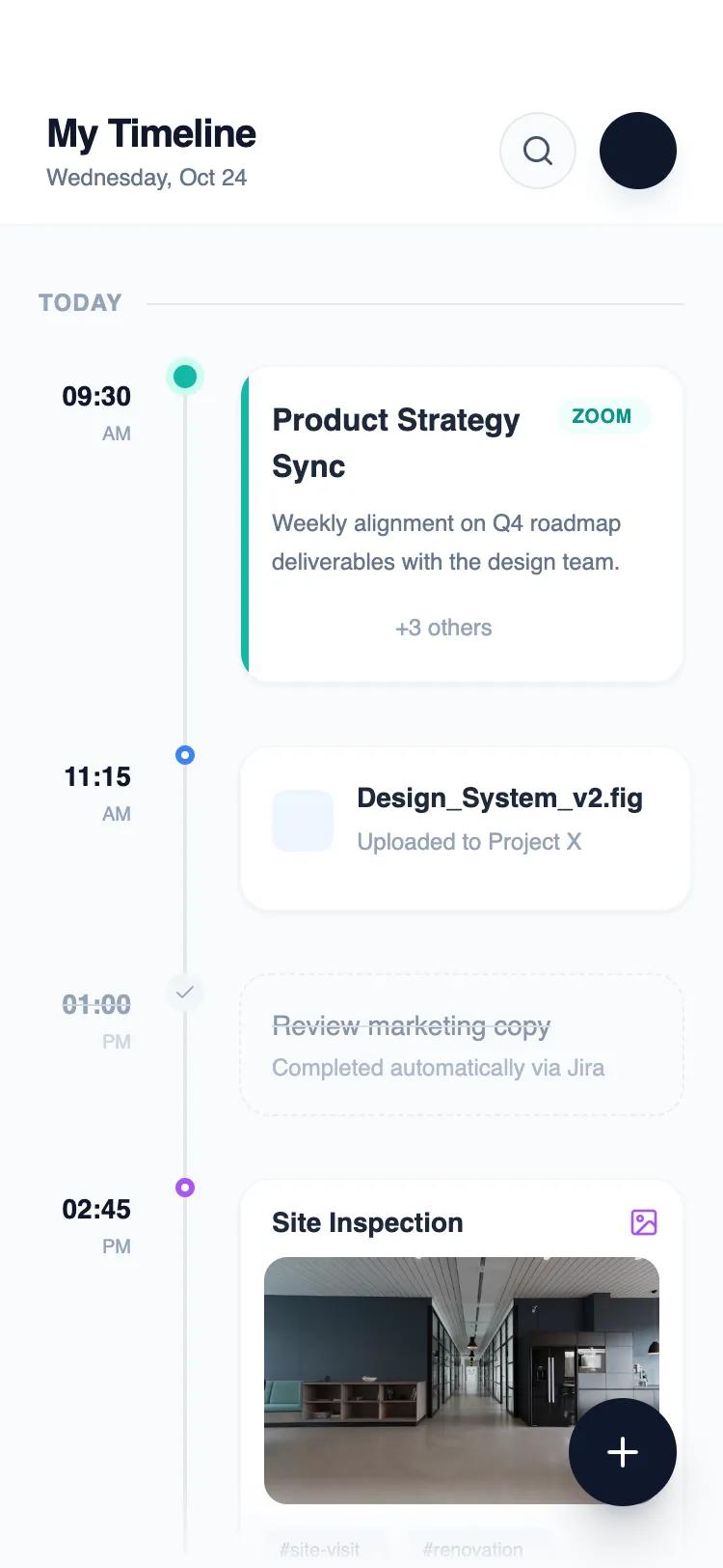 All Prompts
homemobile applayout
Timeline App Home
Вертикальная лента событий для мобильных приложений. Отображает логи активности, проекты, CRM. Группировка по времени или типу.
by Shirley LouLive Preview
Prompt
# Timeline App Home

{
  "summary": "A sophisticated mobile timeline layout with a three-column chronological structure: time labels, a vertical connector track with status-dependent nodes, and interactive content cards. The aesthetic is professional yet vibrant, prioritizing readability and distinct visual states for different activity types.",
  "style": {
    "description": "The style is characterized by a 'Soft Professional' aesthetic using 'Plus Jakarta Sans'. It employs a neutral base (#F8FAFC) with deep text colors (#0F172A) and functional accent colors for categorization. Shadows are soft and diffused, while borders are thin and light (#F1F5F9). Interaction states use subtle scale transforms and background shifts.",
    "prompt": "### Design System Specifications\n\n**Color Palette:**\n- **Primary Surface:** #F8FAFC (Slate 50)\n- **Cards/Header:** #FFFFFF (White) with 90% opacity for glassmorphism\n- **Primary Text:** #0F172A (Slate 900)\n- **Secondary/Muted Text:** #64748B (Slate 500) and #94A3B8 (Slate 400)\n- **Accents:** Teal (#14B8A6), Blue (#3B82F6), Orange (#F97316), Purple (#A855F7)\n- **Borders:** #E2E8F0 (Slate 200) and #F1F5F9 (Slate 100)\n\n**Typography:**\n- **Font Family:** 'Plus Jakarta Sans', sans-serif\n- **Headers:** 20px / 1.25 line-height / Extra Bold (Weight 800)\n- **Section Titles:** 12px / Uppercase / Bold (Weight 700) / Letter-spacing: 0.05em\n- **Card Body:** 12px / 1.5 line-height / Regular (Weight 400)\n- **Time Labels:** 14px / Bold (Weight 700)\n\n**Shadows & Borders:**\n- **Standard Card Shadow:** `0 1px 3px 0 rgba(0, 0, 0, 0.1), 0 1px 2px -1px rgba(0, 0, 0, 0.1)`\n- **FAB Shadow:** `0 20px 25px -5px rgba(15, 23, 42, 0.2)`\n- **Radius:** Cards: 16px (1rem), Buttons/Tags: Full (9999px)\n\n**Animations:**\n- **Hover/Active:** scale(0.98) on click, transition-duration: 200ms\n- **Scroll:** Sticky headers with `backdrop-filter: blur(12px)`"
  },
  "layout_and_structure": {
    "description": "The interface is built on a vertical flex grid with a dedicated column for the timeline 'spine'. It uses a fixed header and a scrollable body with an absolute-positioned floating action button.",
    "prompts": [
      {
        "part": "Sticky Header",
        "prompt": "Create a sticky top navigation bar with 90% white opacity and a 12px blur. Padding should be 56px (pt-14) from top and 24px (px-6) sides. Left side features a vertical flex stack with a Title (20px Bold) and a Subtitle/Date (12px Medium). Right side contains two 40px circular buttons: one search icon with #E2E8F0 border, and one profile avatar with a deep shadow."
      },
      {
        "part": "Group Headers",
        "prompt": "Sticky date separators using a horizontal flex layout. Text should be 12px bold, uppercase, color #94A3B8. Place text on the left followed by a 1px height line (#E2E8F0) that expands to fill the remaining width. Background should use a linear gradient from #F8FAFC to transparent to prevent harsh cut-offs when scrolling."
      },
      {
        "part": "Timeline Row Structure",
        "prompt": "A three-column flex layout with 16px (gap-4) spacing. Column 1 (48px width): Right-aligned time labels (14px Bold) and AM/PM indicators. Column 2 (24px width): Centered vertical track. Column 3 (flex-1): Content card. Ensure the vertical line connects exactly to the center of the timeline nodes."
      },
      {
        "part": "Event Cards",
        "prompt": "Cards use a white background, 16px padding, and 16px border-radius. Implement variations: 1. 'Active' card with a 4px left-border accent in Teal. 2. 'Task' card with dashed Slate-200 borders and 75% opacity. 3. 'Media' card with a nested 128px (h-32) image container using object-fit: cover and a subtle hover scale effect."
      }
    ]
  },
  "special_ui_components": [
    {
      "component": "Timeline Status Node",
      "description": "Adaptive markers that represent event status within the timeline spine.",
      "prompt": "The node is centered in a 24px track. Variations include: 1. 'Active Ring': 12px Teal circle with a 4px ring in Teal-100. 2. 'Standard Dot': 10px White circle with a 3px colored border (Blue/Purple). 3. 'Completed Icon': 20px Slate-100 circle containing a 12px check icon. The vertical connector line (#E2E8F0) must sit behind the node, running from 12px from the top of the container to the very bottom."
    },
    {
      "component": "Floating Action Button (FAB)",
      "description": "High-priority trigger for new event creation.",
      "prompt": "A 56px (14rem) circular button fixed at bottom: 32px, right: 24px. Background: #0F172A. Icon: Lucide Plus in White (24px). Shadow: Heavy Slate-900 tint (rgba(15, 23, 42, 0.2)). Interaction: 105% scale on hover, 95% scale on active click."
    }
  ]
}