All Prompts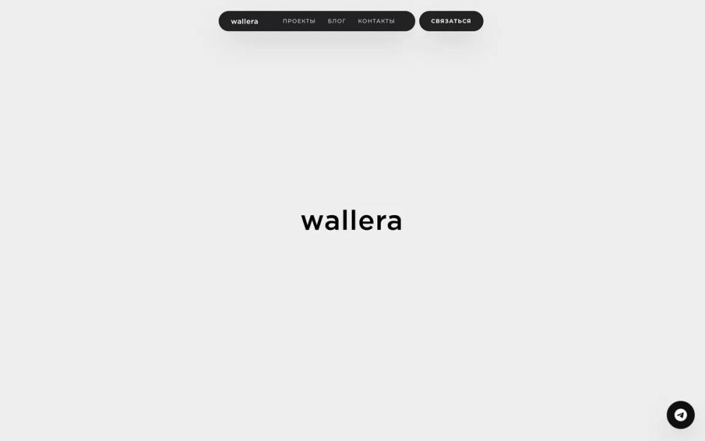 All Prompts
Wallera
Минималистичный UI-шаблон "Wallera" для портфолио. Идеален для креативных профессионалов, брендов. Монохром, широкие изображения, плавная навигация.
by Valeriy GolnikovLive Preview
Prompt
# Wallera

{
  "summary": "An editorial-inspired, high-contrast monochrome design system focused on wide aspect ratios, floating 'pill' navigation components, and smooth scroll transitions. It emphasizes typography as a visual element and uses a grayscale-first approach for imagery.",
  "style": {
    "description": "The style uses the 'Montserrat' font family throughout with varying weights from 100 to 900. It employs a palette of rich black (#0F0F0F), neutral light gray (#EDEDED), and medium gray (#6F6F6F). Animations are centered around a custom cubic-bezier (0.22, 1, 0.36, 1) for scroll reveals and 700ms grayscale-to-color transitions for media. UI elements feature high-contrast inverted states and significant letter spacing for metadata.",
    "prompt": "### Visual Theme\n- **Base Theme**: Minimalist, high-contrast, editorial.\n- **Colors**: \n  - Primary Black: `#0F0F0F` (Backgrounds/Text)\n  - Background Gray: `#EDEDED` (Hero/Sections)\n  - Image Backgrounds: `#F2F2F2` \n  - Muted Text: `#6F6F6F`\n  - Border/Divider: `#E0E0E0`\n  - Accent/FAB Hover: `#ff8562` (Telegram Branding)\n\n### Typography\n- **Font Family**: 'Montserrat', sans-serif (Weights: 400, 500, 600, 700).\n- **Headings (H1)**: `font-size: clamp(1.5rem, 3vw, 3rem)`, `font-weight: 600`, `letter-spacing: -0.03em`, `line-height: 1.1`.\n- **Headings (H2)**: `font-size: clamp(1.25rem, 2.5vw, 2rem)`, `font-weight: 500`, `line-height: 1.2`.\n- **Section Labels**: `font-size: 14px`, `text-transform: uppercase`, `letter-spacing: 0.1em`, color: `#6F6F6F`.\n- **Body Text**: `font-size: 18px`, `line-height: 1.6`, color: `rgb(46, 46, 46)`.\n- **Navigation Labels**: `font-size: 11px`, `font-weight: 500`, `text-transform: uppercase`, `letter-spacing: 0.15em`.\n\n### Animations & Micro-interactions\n- **Scroll Reveal**: `opacity: 0`, `transform: translateY(20px)` transitioning to `opacity: 1`, `transform: translateY(0)` via `cubic-bezier(0.22, 1, 0.36, 1)` over 0.8s.\n- **Image Hover**: Scale `1.02` or `1.05`, transition from `filter: grayscale(100%)` to `filter: grayscale(0%)` over 0.7s.\n- **Link Hover**: 1px underline that expands from center-left using `transform-origin` scaling."
  },
  "layout_and_structure": {
    "description": "The layout features a fixed floating navigation pill at the top, followed by a full-viewport hero section. Content sections are characterized by large vertical spacing (32-48 units) and containers reaching 1440px max-width. It utilizes specific wide-aspect grids for portfolio items and a standard grid for blog content.",
    "prompts": [
      {
        "part": "Floating Pill Header",
        "prompt": "Fixed header at `top: 2rem` centered. Background: `#212123` (Dark Charcoal). Shape: Pill-rounded (rounded-full). Padding: `px-6 py-3`. Left side contains the brand logo (inverted to white). Middle contains navigation links separated by a border-left `#303033`. Right side features an attached or adjacent 'Contact' button pill with identical styling."
      },
      {
        "part": "Hero Section",
        "prompt": "Full viewport height (`min-h-screen`) section. Background: `#EDEDED`. Alignment: Flex center. Content: Single centered brand logo/mark at 200px width. No other text. Implement scroll reveal animation on entry."
      },
      {
        "part": "Project Grid",
        "prompt": "Max-width: 1440px. Grid: Single column. Row gap: 32 units. Each item is a card with a `21:9` aspect ratio container. Image should be grayscale by default. On card hover, image scales and becomes full color. Below the image, an uppercase title in `text-xl` font size."
      },
      {
        "part": "Blog/Article Grid",
        "prompt": "Max-width: 1440px. Grid: 2 columns (MD+). Column/Row gap: 12-16 units. Each item features a `16:9` aspect ratio image container with grayscale-to-color hover logic. Titles use `text-xl` uppercase with tight tracking."
      },
      {
        "part": "Manifesto / Typographic Statement",
        "prompt": "Section with high padding (`py-32 md:py-64`). Background: White. Text: Centered. Features a small section label followed by a massive H2 title (`text-2xl` to `text-4xl`) with `line-height: 1.05` and `tracking-tight`. Max-width of text container: 5xl."
      },
      {
        "part": "Contact & Footer",
        "prompt": "Background: `#0F0F0F`. Text: White/Gray. Contact section uses a 12-column grid. Left side (col-8) has a massive email link (`text-3xl` to `text-5xl`) with a white border-bottom. Right side (col-4) contains metadata (location, social links) in small uppercase caps. Footer is separated by a `#1A1A1A` 1px border, featuring copyright and small 10px legal links."
      }
    ]
  },
  "special_ui_components": [
    {
      "component": "Floating Nav Pill",
      "description": "A dark, rounded-full navigation bar that floats at the top of the viewport.",
      "prompt": "Construct a `fixed` div with `z-index: 1000`. Background color `#212123`. Inner layout: Flex with `justify-between` and `items-center`. Use `rounded-full` for the container. Include a vertical divider between logo and navigation links using `border-l border-[#303033]`. Navigation text must be 11px, weight 500, uppercase, and `#d9d9d9` color."
    },
    {
      "component": "Telegram FAB",
      "description": "A floating action button that changes color and scales on hover.",
      "prompt": "Fixed position at `bottom: 8` and `right: 8`. Size: `w-14 h-14`. Default background: `#0F0F0F`. Icon size: `text-3xl`. On hover, background changes to `#ff8562`, scale increases to `1.1`, and add a heavy `shadow-2xl`."
    }
  ],
  "special_notes": "MUST: Ensure all images are grayscale on load and transition to color only on user hover for the 'gallery' effect. MUST: Use wide aspect ratios (21:9) for primary work to maintain the editorial look. MUST NOT: Use vibrant colors except for the floating action button (Telegram). MUST: Maintain strict uppercase for all labels and headings to ensure a brutalist aesthetic."
}