All Prompts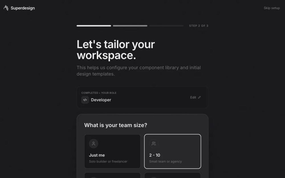 All Prompts
skill
Web App / Onboarding
Дизайн онбординга для веб-приложения. UI-компонент для улучшения пользовательского опыта при первом знакомстве с продуктом.
by Shirley Lou
Prompt
# Web App / Onboarding

# Onboarding Web App Experiences — Skill Reference

## 0. About This Document

**What it is:** The definitive reference for building onboarding flows for any web application. It covers principles, patterns, copy guidance, branding, industry adaptations, and measurement.

**Who it's for:** Designers, developers, product managers, and AI coding agents generating onboarding experiences.

**How to use it:**
- When starting a new onboarding project, read Sections 1–6 for foundations and discovery.
- Reference Section 7 (Flow Anatomy) as your build sequence.
- Use Section 8 for industry-specific customization.
- Consult Section 14 (Checklist) as a pre-ship gate.
- When prompting an AI agent, pass relevant sections as context — they're written to be consumed programmatically.

---

## 1. Core Philosophy

Onboarding exists to collapse the distance between "I just landed here" and "I get why this is valuable to me." Every decision in the flow should be evaluated against that single goal.

- **User-centric, not feature-centric.** Guide users toward *their* outcome, not a product tour.
- **Respect time and autonomy.** Every mandatory step must justify its existence. Everything else is skippable.
- **Design backward.** Define the "aha" moment first, then reverse-engineer the minimal path to reach it.

---

## 2. Key Principles

### 2.1 Personalization
- Ask 1–3 targeted questions early (role, goal, team size, use case) to segment and tailor.
- Create a "this was made for me" feeling — customized dashboards, pre-filled templates, relevant empty states.
- Use answers to gate complexity: beginners see simplified flows, power users skip basics.

### 2.2 Progressive Disclosure
- Reveal information just-in-time, triggered by user actions — not upfront.
- Layer depth: surface essentials first, unlock advanced features as users demonstrate readiness.
- Contextual tooltips, coach marks, and inline hints beat modal tutorials.

### 2.3 Simplicity & Friction Reduction
- Target 3–7 essential steps to reach activation. Fewer is better.
- One focus per screen. Never ask the user to make multiple unrelated decisions at once.
- Offer social SSO / magic links — minimize form fields.
- Always provide skip / "I'll do this later" options for non-critical steps.

### 2.4 Demonstrate Value Before Asking for Commitment
- Let users *do something meaningful* before requiring signup or payment.
- Show real output, not promises. Pre-populated data, sample workspaces, or interactive demos.
- Delay account creation where possible (Duolingo pattern: try → value → signup).

### 2.5 Emotional Engagement
- Progress bars, checklists, and completion percentages create momentum.
- Micro-rewards: confetti, badges, celebratory copy on milestones.
- Animations and transitions should feel responsive and purposeful, not decorative (see Section 3.7 for motion specs).

### 2.6 Contextual & Ongoing Support
- Onboarding doesn't end after the first session. Use drip emails, in-app nudges, and re-engagement prompts.
- Provide self-serve help: searchable docs, tooltips, embedded video snippets.
- Empty states are onboarding surfaces — use them to guide next actions, not show blank screens.

---

## 3. Infrastructure & Guardrails

These are non-negotiable foundations that underpin every onboarding flow. They're not "nice to have" — they're launch blockers.

### 3.1 Performance as Onboarding
- A slow onboarding flow kills trust instantly. Target < 2.5s LCP, < 200ms INP, < 0.1 CLS.
- Skeleton screens and optimistic UI updates make flows *feel* faster.
- Lazy-load non-critical assets; prioritize rendering what the user sees first.

### 3.2 Accessibility from Step Zero
- All onboarding must meet WCAG 2.1 AA minimum: keyboard navigable, screen-reader friendly, sufficient contrast (4.5:1 for body text, 3:1 for large text).
- Don't rely solely on color, animation, or hover states to convey meaning.
- All form inputs need visible labels (not just placeholders), proper `aria` attributes, and logical tab order.
- Test with assistive technologies during prototyping, not after launch.
- Support `prefers-reduced-motion` (see Section 3.7).

### 3.3 Error Handling & Recovery
- Inline validation with clear, human-language error messages — not "invalid input."
- Auto-save progress. If a user refreshes or navigates away, they should resume where they left off.
- Graceful degradation: if a third-party integration fails (OAuth, data import), provide a manual fallback path.
- Network interruption: queue actions locally and sync when connectivity resumes, or show a clear "you're offline" state.

### 3.4 Trust & Transparency
- Explain *why* you're asking for each piece of information ("We ask this to customize your dashboard").
- Show clear data privacy signals: what you collect, how it's used, and that it can be changed later.
- In regulated industries, surface compliance steps (KYC, 2FA) with progress estimates so users know what to expect.

### 3.5 Data Privacy & Permissions
- Cookie consent and tracking disclosures must appear before any analytics fire. Comply with GDPR, CCPA, and local equivalents.
- Notification opt-ins should be contextual ("Get notified when your team replies") — never a cold system prompt on first load.
- Personalization survey data is PII-adjacent. Store securely, document retention policy, and allow users to delete it.
- Marketing opt-ins must be explicit, unchecked by default, and clearly separated from functional consent.

### 3.6 Multi-Device & Session Continuity
- Onboarding state should persist across devices and sessions via server-side storage. If a user starts on desktop and continues on mobile, the flow picks up where it left off.
- Deep links from onboarding emails should resume context, not restart the flow.
- Authentication state must carry through — don't force re-login mid-onboarding.

### 3.7 Animation & Motion
Motion should communicate, not decorate. Every animation needs a reason: showing progress, confirming action, guiding attention, or easing transitions.

**Specs:**
- **Duration:** 150–300ms for micro-interactions (button states, toggles), 300–500ms for transitions (page changes, modals), 500–800ms for celebratory moments (confetti, success).
- **Easing:** Use `ease-out` for entrances, `ease-in` for exits, `ease-in-out` for repositioning. Avoid `linear` for UI motion.
- **Reduced motion:** Always respect `prefers-reduced-motion: reduce`. Replace animations with instant state changes or simple opacity fades. Never rely on motion alone to convey information.
- **Performance:** Use `transform` and `opacity` for animations (GPU-accelerated). Avoid animating `width`, `height`, `top`, `left`, or layout-triggering properties.

### 3.8 Localization & Multi-Language Flows
- Plan for i18n from the start: externalized strings, RTL layout support, locale-aware date/number formats.
- **Language detection:** Auto-detect from browser `Accept-Language` header, with a visible language selector in the onboarding header/footer for manual override.
- **Flow logic:** Some personalization questions may not apply in all markets. Use locale-aware branching (e.g., skip "state/province" for countries that don't use them; adjust compliance steps per region).
- **Copy expansion:** Design layouts with 30–40% text expansion headroom for languages like German or French that run longer than English.
- Imagery, copy tone, and examples should be culturally neutral or localized per market.

### 3.9 Versioning & Migration
- **Version tagging:** Every onboarding flow gets a version identifier (e.g., `onboarding_v2.1`). Track which version each user completed.
- **New users:** Always get the latest version.
- **Existing users (completed prior version):** Surface a lightweight "What's New" flow for significant changes — a dismissible modal or inline banner, never a forced re-onboarding.
- **Existing users (mid-flow on old version):** Let them finish the version they started. Migrate them to the new version only on next login if their current state maps cleanly.
- **Changelog:** Maintain an internal log of what changed between versions and why, tied to the metrics that motivated the change.

---

## 4. Copy & Microcopy

Onboarding is 50% writing. Every string the user reads — button labels, headings, progress indicators, error messages, empty states — shapes their experience as much as layout and color.

### 4.1 Voice & Tone Calibration
- Match the product's overall tone, but onboarding can be slightly warmer and more encouraging than the core app.
- **Tone spectrum:** Calibrate per step. Early steps (welcome, personalization) are warmer. Functional steps (data import, integration setup) are clearer and more direct. Completion is celebratory.
- Avoid jargon in early steps. Introduce product-specific terminology gradually, with inline definitions if needed.

### 4.2 Component-Level Copy Guidelines

| Component | Guidelines | Good Example | Bad Example |
|---|---|---|---|
| **Headings** | Action-oriented, benefit-focused. 4–8 words. | "Set up your workspace" | "Workspace Configuration Settings" |
| **Subheadings** | Explain *why* this step matters. 1 sentence. | "This helps us show you relevant templates" | "Please complete the following fields" |
| **Buttons (Primary)** | Verb + object. Describe what happens next. | "Create my workspace" | "Next" / "Submit" / "Continue" |
| **Buttons (Secondary)** | Low-pressure, no guilt. | "I'll do this later" | "Skip" (too blunt) / "No thanks" (implies rejection) |
| **Progress indicators** | Concrete, not abstract. | "Step 2 of 4 — Choose your tools" | "Step 2" |
| **Tooltips** | One thing, one sentence. No paragraphs. | "Pin items here for quick access" | "This feature allows you to organize your most-used items by pinning them to this section for easy retrieval" |
| **Error messages** | Say what went wrong + how to fix it. | "That email is already registered — try signing in instead" | "Error: duplicate entry" |
| **Empty states** | Guide, don't blame. Include CTA. | "No projects yet — create your first one to get started" | "Nothing to show" |
| **Celebration / completion** | Specific, earned, not generic. | "Your workspace is ready — your first template is waiting inside" | "Congratulations! You've completed onboarding!" |
| **Placeholder text** | Realistic example data, not instructions. | "e.g., Acme Design Team" | "Enter your team name here" |

### 4.3 Copy Anti-Patterns
- **"Welcome to [App]!"** as a standalone screen with no action — wastes a step.
- **"Just one more thing…"** repeatedly — erodes trust. Be honest about how many steps remain.
- **Passive voice in CTAs** — "Your account will be created" vs. "Create your account."
- **Guilt-tripping skips** — "No, I don't want to be more productive" is a dark pattern.
- **Unexplained data collection** — Every field without context ("Why do you need this?") increases drop-off.

---

## 5. Branding & Visual Identity Collection

Every onboarding experience must look and feel like the product it belongs to. Branding is **Step 0** — resolve it before generating any screens.

### 5.1 Input Paths (in priority order)

**Path A — Full Brand Kit Upload**
The ideal scenario. Ask for:
- **Logo** — Primary logo (SVG preferred), logomark/icon variant, light + dark versions
- **Colors** — Primary, secondary, accent, neutral palette. Include semantic tokens: success, warning, error, info
- **Typography** — Heading and body font families, weight scale, size scale (or a type ramp)
- **Icons** — Icon set or library preference (e.g., Lucide, Phosphor, custom)
- **Imagery style** — Photography vs. illustration, mood references, do/don't examples
- **Tone of voice** — Formal ↔ casual, playful ↔ serious, technical ↔ approachable. Include sample copy if available
- **Spacing / radius / elevation** — Border radius tokens, shadow styles, spacing scale
- **Existing design system** — Link to Figma library, Storybook, or component docs if they exist

**Path B — Auto-Extract from Existing Site/URL**
If the user provides a live URL:
- Scrape and extract: dominant colors, font stacks, logo images, favicon, spacing patterns
- Present extracted tokens for user confirmation/adjustment before applying
- Flag any inconsistencies ("Your site uses 4 different font sizes — want to consolidate?")

**Path C — Basics Only (Logo + Colors + Fonts)**
Minimum viable branding:
- Logo upload (any format)
- Primary + secondary color (hex or color picker)
- Font preference (Google Fonts selection or upload)
- Generate remaining tokens (neutrals, semantic colors, type scale) automatically from these inputs

**Path D — No Brand Kit (Preset Themes)**
For users starting from scratch or prototyping:
- Offer 4–6 curated preset themes (e.g., "Clean & Minimal," "Bold & Vibrant," "Dark & Technical," "Warm & Friendly")
- Each theme includes a complete token set: colors, fonts, radius, shadows
- Allow customization on top of the preset (swap primary color, change font)
- Make it clear this can be replaced with real branding later

### 5.2 Branding Collection UX Guidelines

- Ask for branding **before** generating any onboarding screens — it's a dependency, not an afterthought.
- Keep the upload flow itself frictionless: drag-and-drop, paste URL, or pick a preset. No 20-field forms.
- Show a **live preview** of the brand applied to a sample onboarding screen as assets are added.
- Auto-generate a **design token file** (CSS variables / JSON) from collected assets for downstream use.
- Allow users to revisit and update branding at any time without regenerating everything manually.

### 5.3 Fallback Behavior

| Scenario | System Behavior |
|---|---|
| No logo provided | Use app name as styled text (primary font, primary color) |
| No colors provided | Default to preset theme; prompt user to customize |
| No fonts provided | Default to a safe, modern system font stack |
| Incomplete palette | Auto-generate neutrals, semantic colors, and tints/shades from provided primary |
| Conflicting assets (e.g., low-contrast combinations) | Flag accessibility issues and suggest corrections |

---

## 6. Discovery & Needs Assessment

Before designing any onboarding flow, answer these questions. Skip this at your own risk — most onboarding failures trace back to assumptions made here.

### 6.1 Understand the Challenge
- What are users trying to accomplish when they arrive?
- What's confusing or unclear about the current experience (if one exists)?
- Where do users currently get stuck or drop off? (Analytics, support tickets, session recordings)
- What is the "aha moment" — the single action or realization that converts a visitor into an engaged user?

### 6.2 Understand the Users
- **Experience level:** Beginners, power users, or mixed? Do they know the category or is this entirely new?
- **Motivation:** Excited and exploring? Required by work/admin? Evaluating against a competitor?
- **Time commitment:** Do they have 2 minutes or 20? Are they in a meeting, on mobile, or focused at a desk?
- **Prior mental models:** Coming from a competitor (map to familiar concepts)? New to the category (explain the "why" first)?

### 6.3 Define Success
- What's the minimum a user needs to learn to get value? (Not "everything" — the 20% that delivers 80%)
- What's the key activation action? (First project created? First invite sent? First output generated?)
- What metrics prove onboarding worked? (Activation rate, time to value, D7 retention, support ticket reduction)

### 6.4 Decide If You Even Need Onboarding
Not every app needs a dedicated flow. Test without one first. If users can figure out the core value from the interface alone, your "onboarding" might just be good empty states and contextual hints. Add formal onboarding only when:
- The product has novel interaction patterns users won't have seen before
- Personalization significantly changes the experience
- There's a multi-step setup that can't be deferred
- The "aha moment" requires guidance to reach

---

## 7. Onboarding Flow Anatomy

A well-structured onboarding flow follows this general sequence. Not all steps are required for every app — pick what serves the user. Branding (Section 5) must be resolved before any screens are generated.

```
0. Branding Resolution (Section 5)
   — Collect or resolve brand assets before generating screens

1. Landing / Entry Point
   - Clear value proposition, single primary CTA
   - Social proof (logos, testimonials, user count)

2. Signup / Authentication
   - Social SSO, magic link, or minimal email + password
   - Defer to post-value if possible

3. Personalization Survey (1–3 questions)
   - Role, goal, use case, team size
   - Use answers to branch the flow

4. Workspace / Environment Setup
   - Pre-populated templates based on survey answers
   - Import existing data if applicable (CSV, integrations)

5. First Meaningful Action (the "aha" moment)
   - Guided task that produces real output
   - Interactive, not passive (no slideshow tours)

6. Contextual Feature Education
   - Tooltips, coach marks, inline hints — triggered by user behavior
   - Drip over time, don't front-load

7. Social / Team Setup (if applicable)
   - Invite teammates, configure roles
   - Shared checklist for team activation

8. Ongoing Engagement
   - Checklists, progress tracking, drip emails
   - In-app help center, empty state guidance
   - Re-engagement nudges for dormant users
```

---

## 8. Industry-Specific Adaptations

### 7.1 Quick Reference

| Industry | Key Focus | Typical Pattern | Watch Out For |
|---|---|---|---|
| **SaaS / Productivity** | Quick wins, role-based personalization | Self-select → template → first task | Over-touring features nobody asked about |
| **Finance / Fintech** | Security, compliance (KYC/AML), trust | Progressive verification with time estimates | Making compliance feel punitive; hiding fees |
| **E-Commerce** | Immediate browsing, low friction | Guest access → value → account creation post-purchase | Forcing signup before showing products |
| **Healthcare** | Privacy, sensitivity, trust | Gentle screening, non-judgmental copy | Clinical tone; overwhelming consent forms |
| **Education** | Bite-sized intros, gamification | Assessment → personalized path → streak/reward | Front-loading complex lessons |
| **Gaming / Entertainment** | Instant engagement, visual cues | Play immediately → progressive mechanics | Text-heavy tutorials; blocking core content |
| **Social Media** | Fast connections, privacy controls | Social login → interest selection → first post | Aggressive permission requests upfront |
| **Developer Tools** | Code-first, minimal hand-holding | Quick install → "Hello World" → docs | See 7.2 |
| **AI / ML Products** | Demystify, set expectations, show output | Interactive demo → real result → iterate | See 7.3 |

### 7.2 Developer Tools — Deep Dive

Developer onboarding is fundamentally different from consumer onboarding. Developers are impatient with hand-holding but appreciate clear, thorough documentation.

**Principles:**
- **Code-first:** The fastest path to value is running code, not reading slides. Prioritize "Hello World" in under 2 minutes.
- **Respect expertise variance:** A senior backend engineer and a junior frontend developer have very different needs. Segment by experience level and language/framework preference.
- **CLI + dashboard parity:** If your product has both a CLI and a web dashboard, onboarding should support both paths without favoring one.
- **Copy-paste ready:** Every code snippet shown during onboarding should be directly copy-pasteable and functional. No pseudocode, no `...` placeholders.

**Flow pattern:**
```
1. Quick start selector: language / framework / use case
2. Install / connect (one command, copy-pasteable)
3. "Hello World" — first successful API call or build
4. Guided second task (something closer to their real use case)
5. Point to docs, community, and support — then get out of the way
```

**What to avoid:**
- Assuming all developers have the same context (DevOps ≠ frontend ≠ data science)
- Onboarding that requires leaving the terminal to complete
- Marketing copy in technical flows — developers actively distrust it
- Broken code samples (test every snippet in CI)

### 7.3 AI / ML Products — Deep Dive

AI products face a unique onboarding challenge: users arrive with wildly varying mental models of what AI can do, ranging from "magic" to "useless." Onboarding must calibrate expectations while demonstrating genuine value.

**Principles:**
- **Show, don't tell.** Let users see real AI output within the first 60 seconds. An interactive demo with their own input beats any explanation.
- **Set honest expectations.** Surface limitations early: "Works best with X, less reliable for Y." Users who understand boundaries trust the product more than those who discover them painfully.
- **Teach prompting as onboarding.** If the product involves user input that shapes AI output (prompts, configurations, parameters), make the onboarding *about* building that skill. Show before/after examples of good vs. poor inputs.
- **Provide escape hatches.** Always show users how to edit, regenerate, or override AI output. Autonomy reduces anxiety.

**Flow pattern:**
```
1. Brief context: what the AI does (1 sentence, not a paragraph)
2. Interactive demo: user provides real input → AI generates real output
3. "Before / After" comparison: show how better input improves output
4. Guided iteration: user refines their first result
5. Explain controls: editing, regenerating, adjusting parameters
6. Set ongoing expectations: where to get help, how the AI improves
```

**What to avoid:**
- Overpromising capabilities ("AI that does everything")
- Hiding the AI's role — be transparent that output is AI-generated
- Onboarding that only shows cherry-picked perfect examples
- No feedback loop — users need to report bad output easily from day one

---

## 9. Responsive & Multi-Device Strategy

Onboarding must work across screen sizes, not just "fit." Flows designed for desktop often break on mobile — not technically, but experientially.

### 8.1 Adaptive Flow Design
- **Step reduction on mobile:** A 7-step desktop flow may need to consolidate to 4–5 steps on mobile. Combine related questions into single screens or defer non-essential steps.
- **Input optimization:** Use native input types (`type="email"`, `type="tel"`, date pickers) for mobile keyboards. Prefer selection (taps) over text input where possible.
- **Thumb zone awareness:** Primary CTAs belong in the bottom 40% of the screen on mobile. Avoid top-right actions that require hand repositioning.
- **Swipe vs. click:** Horizontal swipe navigation works well for linear mobile onboarding (cards, carousels). Always provide a tap alternative.

### 8.2 Layout Adaptations

| Element | Desktop | Mobile |
|---|---|---|
| **Personalization survey** | Side-by-side questions with illustration | Stacked single question per screen |
| **Progress indicator** | Horizontal step bar at top | Compact dots or "2 of 4" text |
| **Feature education** | Tooltip anchored to UI element | Full-width bottom sheet or inline card |
| **Media (video/image)** | Embedded inline with text | Above the fold, auto-scaled, optional play |
| **Multi-column layouts** | 2–3 columns for options/cards | Single column, vertically scrollable |

### 8.3 Testing Requirements
- Test on real devices, not just browser emulators. Touch targets, scroll behavior, and keyboard interactions differ.
- Validate that auto-save and session continuity (Section 3.6) work across device switches mid-onboarding.

---

## 10. Design Patterns & UI Components

### 10.1 Patterns to Use
- **Checklists** — Visible progress, clickable steps, completion state. Exploit the Zeigarnik Effect (Section 10).
- **Empty States** — Every blank screen is a missed onboarding opportunity. Use illustration + CTA + guiding copy (see Section 4.2 for empty state copy).
- **Inline Tooltips / Coach Marks** — Contextual, dismissible, triggered by first encounter with a feature. One tooltip at a time — never stack them.
- **Welcome Modals** — Brief (1–2 screens max), skippable, focused on immediate next step.
- **Sample / Demo Data** — Pre-populated content so users see the product "alive" before investing effort.
- **Progress Bars** — Show completion percentage for multi-step flows. Start at ~20% not 0% (Endowed Progress Effect — Section 10).

### 10.2 Patterns to Avoid
- **Multi-screen slideshow tours** — Low engagement, high skip rate. Users retain almost nothing.
- **Video-only onboarding** — No interactivity; can't be skimmed; accessibility issues; requires captions and transcripts.
- **Mandatory feature tours** — Users resent being forced; provide on-demand access instead.
- **Wall-of-text welcomes** — Nobody reads paragraphs in a setup flow. If you need to explain, use visuals.

### 10.3 Empty State Taxonomy

Empty states are one of the most powerful onboarding surfaces in any app. Every blank screen is a teaching moment. Design them intentionally based on *why* the state is empty:

| Type | Context | Design Approach |
|---|---|---|
| **First use** | User has never used this feature | Emphasize value ("Projects help you organize work and collaborate"). Offer templates or examples. Strong CTA: "Create your first project" or "Start from template." Include illustration or preview of what populated state looks like. |
| **User cleared** | User intentionally deleted/archived everything | Light touch. They know the feature — don't re-explain value. Easy path to recreate: "Create new" with minimal friction. |
| **No results** | Search or filter returned nothing | Acknowledge the attempt. Suggest alternatives: "Try a different search term" or "Clear filters." Never just show a blank screen. |
| **No permissions** | User can't access this area | Explain *why* clearly ("You need Admin access to view this"). Show *how* to get access ("Ask your team admin") or who to contact. |
| **Error / failed to load** | Data couldn't be retrieved | Explain what happened in plain language. Offer retry. Don't blame the user. Provide fallback or cached state if possible. |

**Every empty state must include:**
1. **What will be here** — "Your recent projects will appear here"
2. **Why it matters** — "Projects help you organize work and track progress"
3. **How to get started** — Clear CTA: `[Create project]` or `[Import from template]`
4. **Visual interest** — Illustration, icon, or preview (not just text on a blank page)
5. **Contextual help** — "Need help? [Watch 2-min tutorial]" (optional but valuable)

### 10.4 Feature Discovery & Ongoing Adoption

Onboarding doesn't end after initial setup. Feature discovery is the long tail of onboarding — surfacing the right capability at the right moment throughout the user's lifecycle.

**Feature announcements (new releases):**
- Highlight what's new and *why it matters to this user* (not just changelog items)
- Let users try immediately from the announcement — link directly to the feature
- Dismissable, never blocking. Show once, respect dismissal.
- Consider segmenting: only show announcements relevant to the user's role/usage pattern.

**Progressive feature badges:**
- Subtle indicators (dot, "New" badge) on unused features the user would benefit from.
- Remove automatically after first use or manual dismissal.
- Don't badge everything — pick 1–2 features at a time based on the user's stage.

**Contextual feature suggestions:**
- Triggered by user behavior: "You've created 5 projects manually — did you know you can import from CSV?"
- Must be dismissable with "Don't show again" that is actually permanent.
- Appear at point of use, not in a disconnected notification center.

**"What's New" changelog:**
- Accessible from help menu or settings — users should be able to browse at their pace.
- Organized by recency with clear dates.
- Each entry: what changed, why, and a link to try it or learn more.

### 10.5 Guided Tours & Walkthroughs

Tours have a bad reputation because most are poorly designed. When done right — short, interactive, and optional — they can be effective for complex interfaces.

**When tours ARE appropriate:**
- Complex interfaces with many features where the core workflow isn't obvious
- Significant UI changes to an existing product (existing users need reorientation)
- Industry-specific tools where domain knowledge affects how features are understood

**When to skip tours:**
- The interface follows standard conventions users already know
- The app is simple enough that empty states and tooltips suffice
- Users are primarily power users who resent hand-holding

**How to design effective tours:**
- **Spotlight pattern:** Highlight one UI element at a time, dim the rest of the page. Focus attention.
- **Keep it short:** 3–7 steps maximum per tour. If you need more, break into multiple contextual tours.
- **Interactive, not passive:** Let users click real buttons, fill real fields — not just "Next, Next, Next."
- **Workflow-oriented copy:** "Create a project" not "This is the project button." Focus on what to do, not what things are.
- **Provide sample data** so actions during the tour produce real results.
- **Allow free navigation:** Users should be able to click through steps freely, go back, or exit at any point.
- **Always include "Skip tour"** — visible, not hidden. No guilt.
- **Make replayable:** Add "Replay tour" to the help menu. Users who skipped initially may want it later.

**Interactive tutorials / sandbox:**
For high-stakes or complex products, consider a sandbox environment:
- Pre-loaded with sample data so actions are risk-free
- Clear objectives: "Create a chart showing sales by region"
- Step-by-step guidance with validation (confirm they did it right)
- Graduation moment: "You're ready! Here's your real workspace."
- Keep sandbox data deletable — don't pollute the real environment.

### 10.6 In-Product Help System

A well-designed help system is the safety net beneath your onboarding. Users who skip or forget onboarding steps should always have a path to help.

**Help patterns to implement:**
- **`?` icon** near complex features or unfamiliar terminology — opens a brief inline explanation or links to docs.
- **Keyboard shortcut hints** shown inline on relevant elements (`⌘K` on the search box, `⌘N` on create buttons). Teaches power-user shortcuts passively.
- **Contextual "Learn more" links** in tooltips and feature descriptions — link to specific doc sections, not generic help home.
- **Searchable help center** accessible from a persistent help icon (bottom-right or in the header). Must support keyword search across docs, FAQs, and tutorials.
- **Video tutorials** for complex workflows — keep under 2 minutes each, with chapters/timestamps. Embed in-product at point of use, not just in an external knowledge base.
- **Command palette** (`⌘K` or `/` shortcut) that surfaces both actions and help content in one search. Users increasingly expect this pattern.

**Help behavior rules:**
- Help content should be contextual to the current screen/feature, not generic.
- Never show the same dismissed tooltip or hint again (track dismissals per user, server-side).
- Returning users who completed onboarding should never see initial onboarding again — only new feature announcements and contextual help.

---

## 11. Psychological Principles at Play

| Principle | What It Means | Concrete Implementation |
|---|---|---|
| **Zeigarnik Effect** | People remember and are drawn to incomplete tasks. | Show a checklist with 1 item pre-completed on first load. Place it persistently in the sidebar or dashboard. Users will return to finish it. |
| **Endowed Progress Effect** | People are more likely to finish if they feel they've already started. | Initialize the onboarding progress bar at 15–20% after signup. Label it: "You're already on your way — 3 steps to go." |
| **Hick's Law** | More choices = slower decisions = higher abandonment. | Max 3–4 options per screen. For personalization surveys, use curated presets, not open-ended fields. |
| **Jakob's Law** | Users expect your app to work like others they know. | Use conventional patterns: top-left logo, left sidebar nav, bottom-right primary CTA on mobile. Don't reinvent standard flows. |
| **Peak-End Rule** | Users judge an experience by its most intense moment and its ending. | Invest in two moments: the "aha" (first meaningful output) and the completion celebration. Make both feel specific and earned. |
| **Aesthetic-Usability Effect** | Beautiful interfaces are perceived as more usable and trustworthy. | Invest in visual polish for onboarding screens — they are the first impression. A polished flow buys forgiveness for rough edges elsewhere. |
| **Doherty Threshold** | System response under 400ms keeps users in flow state. | Every onboarding interaction (button click, step transition, data save) should respond in < 400ms. Use optimistic UI and skeleton states. |
| **Commitment & Consistency** | Small early commitments increase follow-through on larger ones. | Start with a trivially easy action (choose an avatar, pick a color theme) before asking for meaningful input. Each "yes" makes the next one easier. |
| **Serial Position Effect** | People remember the first and last items in a sequence best. | Put the most important personalization question first and the most memorable action (the "aha") last. Bury friction in the middle. |

---

## 12. Measuring Success

### 11.1 Key Metrics

| Metric | What It Tells You | Target Benchmark |
|---|---|---|
| **Activation Rate** | % of signups completing the key "aha" action | > 40% for B2B SaaS, > 60% for consumer |
| **Time to Value (TTV)** | Duration from signup to first meaningful outcome | < 3 minutes for simple apps, < 10 for complex |
| **Onboarding Completion Rate** | % who finish the full flow | > 70% (with per-step breakdown for drop-off) |
| **Step Drop-off Rate** | Where users abandon | Any single step losing > 20% needs investigation |
| **Retention (D1 / D7 / D30)** | Are onboarded users coming back? | D1 > 40%, D7 > 25%, D30 > 15% (varies by category) |
| **Support Ticket Volume** | Is onboarding reducing "how do I…" tickets? | Decreasing trend post-launch |
| **NPS / CSAT** | User sentiment post-onboarding | NPS > 30 |

### 11.2 Instrumentation
- Track every step as a discrete event: `step_viewed`, `step_completed`, `step_skipped`, `step_error`.
- Log time-on-step to identify confusion (too long) or meaninglessness (too short / instant skip).
- Build funnel visualizations to identify drop-off points.
- Segment metrics by user type, acquisition channel, device, locale, and personalization branch.
- Use tools like Mixpanel, Amplitude, PostHog, or similar for path analysis and cohort tracking.

### 11.3 Optimization Loop
```
Measure → Identify drop-off → Hypothesize cause → A/B test fix → Ship winner → Repeat
```
Run this loop continuously. Onboarding is never "done."

---

## 13. Technical Considerations

- **State management** — Persist onboarding progress server-side. Users should resume, never restart. Store: current step, survey answers, branding selections, timestamp per step.
- **Feature flags** — Gate onboarding variations behind flags for A/B testing and gradual rollouts. Minimum flags: `onboarding_version`, `onboarding_variant`, `show_onboarding`.
- **Analytics events** — Instrument every interaction: step views, completions, skips, errors, time-on-step (see Section 12.2).
- **Responsive design** — Onboarding must work flawlessly on mobile, tablet, and desktop. See Section 9 for adaptive strategies.
- **Loading performance** — Onboarding screens should be among the fastest pages in your app. Preload the next step's assets while the user is on the current step.
- **Graceful degradation** — If JS fails, a CDN is slow, or an integration times out, the flow should still be usable with a manual fallback.
- **Deep link support** — Email CTAs and invite links should land users at the right step, with auth state and context preserved.
- **Design tokens** — Generate CSS custom properties / JSON tokens from branding input (Section 5). All onboarding components consume these tokens — no hardcoded colors or font names.
- **Component architecture** — Build onboarding as a composable step system (step renderer, progress tracker, survey engine, branding provider) so flows can be reconfigured without rewriting UI code.
- **Dismissal & completion tracking** — Store per-user state for every tooltip, tour, and feature announcement (server-side, not just localStorage). Respect dismissals permanently. Never re-show completed onboarding to returning users.

### 13.1 Recommended Libraries & Tools

| Category | Libraries | Notes |
|---|---|---|
| **Tooltips** | Tippy.js, Floating UI (Popper.js successor) | Lightweight, accessible, customizable positioning |
| **Guided tours** | Shepherd.js, React Joyride, Intro.js | Spotlight/dim pattern, step sequencing, skip support |
| **Modals** | Radix Dialog, Headless UI, Ariakit | Focus trap, backdrop, ESC-to-close, accessible by default |
| **Progress tracking** | Custom (server-side preferred) | Store completion state per user, per step. Don't rely solely on localStorage. |
| **Analytics** | Mixpanel, Amplitude, PostHog, Segment | Event tracking, funnel visualization, cohort analysis |
| **A/B testing** | LaunchDarkly, Statsig, Unleash, PostHog | Feature flags + experiment framework |
| **Help center** | Intercom, Crisp, custom searchable docs | In-product contextual help, search, and video embedding |
| **Command palette** | cmdk (React), Ninja Keys, kbar | `⌘K` pattern for actions + help search |

---

## 14. Checklist Before Shipping

### 🔴 Must Ship (Launch Blockers)

- [ ] Can a new user reach the "aha" moment in under 3 minutes?
- [ ] Is every mandatory step truly necessary? Can any be deferred or removed?
- [ ] Are all steps skippable except authentication?
- [ ] Is branding resolved (uploaded, extracted, or preset selected) before screens are generated?
- [ ] Do all screens use resolved design tokens consistently?
- [ ] Is progress saved server-side across sessions and devices?
- [ ] Is the flow accessible (keyboard nav, screen reader, 4.5:1 contrast, `prefers-reduced-motion`)?
- [ ] Is performance optimized (< 2.5s LCP on onboarding screens)?
- [ ] Are analytics events firing for every step (view, complete, skip, error)?
- [ ] Does the flow handle errors gracefully (validation, network issues, integration failures)?
- [ ] Has it been tested with real users (not just the team)?
- [ ] Is copy reviewed: no jargon, action-oriented CTAs, no guilt-trip skips?
- [ ] Are privacy/consent requirements met (cookie consent, GDPR, marketing opt-ins)?

### 🟡 Ship Soon After (First Iteration)

- [ ] Does the flow adapt based on user type / survey answers (personalization branching)?
- [ ] Are empty states designed with guidance and CTAs?
- [ ] Is there a team/collaborative onboarding path (admin vs. invited member)?
- [ ] Are drip emails and re-engagement nudges set up for post-onboarding?
- [ ] Is the flow tested on real mobile devices (not just emulators)?
- [ ] Is localization scaffolded (externalized strings, RTL support, expansion headroom)?

### 🟢 Optimization Phase (Data-Driven)

- [ ] A/B test framework in place for step variations?
- [ ] Drop-off funnel dashboard built and monitored?
- [ ] Post-onboarding NPS/CSAT survey implemented?
- [ ] Onboarding versioning and migration strategy documented (Section 3.9)?
- [ ] Is there a plan for ongoing iteration based on data?

---

## 15. Collaborative & Team Onboarding

For multi-user products, onboarding isn't one flow — it's at least two.

### 14.1 Admin / Creator Path
The person who sets up the workspace:
- Account creation → workspace naming → branding/config → invite team
- Provide setup checklist with team-visible progress ("Your team setup is 60% complete")
- Allow admins to customize what invited members see on first login

### 14.2 Invited Member Path
People joining an existing workspace:
- Accept invite → authenticate (SSO auto-join if configured) → land in pre-configured workspace
- Show brief orientation to the *team's* setup, not the product's full feature set
- Personalization is lighter: role, notification preferences, display name
- Pre-filled context from admin setup (team name, project, relevant channels already visible)

### 14.3 Shared Team Progress
- "Your team has completed 3 of 5 setup steps" — visible to all members
- Social proof within the team: "12 of 15 members have joined"
- Admin dashboard showing who has/hasn't completed onboarding

---

## 16. Dark Patterns — Explicit Prohibitions

These are not "anti-patterns to avoid" — they are practices that must never appear in any onboarding flow.

- ❌ **Disguised marketing opt-ins** — Pre-checked newsletter boxes, or bundling marketing consent with functional consent.
- ❌ **Artificial urgency** — "Complete setup in the next 10 minutes!" with a countdown timer.
- ❌ **Confirm-shaming** — "No thanks, I don't want to grow my business" as a skip option.
- ❌ **Hidden costs** — Revealing pricing or limitations only after the user has invested time in setup.
- ❌ **Punishment for skipping** — Degrading experience, hiding features, or showing passive-aggressive messaging when users skip optional steps.
- ❌ **Roach motel** — Easy to start, impossible to cancel or delete account. Offboarding should be as clear as onboarding.
- ❌ **Forced continuity** — Silently converting a free trial to a paid plan without clear, advance notification.
- ❌ **Misdirection** — Using visual hierarchy to make the "less favorable to user" option look like the primary CTA.

---

## 17. Anti-AI Design — Avoiding the "AI Look"

AI-generated interfaces share a recognizable visual DNA that instantly signals "this wasn't designed by a human." Avoiding these patterns is critical for credibility and trust.

### 16.1 The Problem

Users increasingly recognize AI-generated design. When an onboarding flow looks "AI-made," it signals low effort, undermines brand trust, and makes the product feel generic. The goal isn't to hide AI — it's to produce output that meets the same quality bar as human-crafted design.

### 16.2 The Grid Problem

The most common AI design tell is **rigid, uniform grid layouts** — evenly spaced cards, perfectly symmetrical columns, identical spacing everywhere. Real design uses intentional asymmetry and visual hierarchy.

**What AI defaults to:**
- 3-column or 4-column grids with identically sized cards
- Uniform padding and margins on every element
- Perfect symmetry on every screen
- Feature grids where every item has: icon → heading → description, repeated 6–12 times
- Bento grids with no clear visual priority

**What good design does instead:**
- **Vary element sizes** to create hierarchy. The most important item is largest. Not everything gets equal weight.
- **Break the grid intentionally.** A full-width hero, followed by a 2-column section, followed by a single centered CTA is more effective than 3 uniform columns.
- **Use whitespace asymmetrically.** More space around the primary action, tighter grouping for related secondary elements.
- **Limit card-based layouts.** If you must use cards, vary their sizes, use a max of 3, and make one visually dominant.

### 16.3 Other AI Design Tells to Avoid

| AI Tell | Why It Looks AI-Generated | Human Design Alternative |
|---|---|---|
| **Uniform icon grids** | 6+ icons in a grid, same size, same style, evenly spaced — looks like a template | Use icons sparingly. 2–3 max per section. Vary placement — inline with text, not always above headings. |
| **Generic gradient blobs** | Purple-to-blue blobs as background decoration — the AI aesthetic cliché of 2024–2025 | Use brand colors. If gradients, make them subtle and purposeful. Or skip them entirely for flat/textured backgrounds. |
| **Overuse of glassmorphism** | Frosted glass cards stacked everywhere with no functional reason | Reserve glass effects for one focal element (e.g., a modal or hero card). Not every surface needs blur. |
| **Generic stock illustrations** | Flat vector people in purple/blue sitting at laptops | Use product screenshots, real UI previews, or brand-specific illustration. If no assets, use abstract shapes over generic people. |
| **"Hero + 3 features + CTA" layout** | Every section follows the same structure, which is the default template of every AI tool | Vary section structures. Mix full-width, split-screen, single-column prose, and embedded interactive elements. |
| **Excessive border radius** | Every element has `rounded-2xl` or higher — soft pill shapes everywhere | Mix radius values. Cards might be `rounded-lg`, buttons `rounded-md`, avatars `rounded-full`. Consistency ≠ uniformity. |
| **Too many shadows/elevations** | Every card, button, and container has a drop shadow | Reserve elevation for interactive elements (buttons, modals, dropdowns). Flat surfaces should be the default. |
| **Decorative-only animations** | Floating particles, rotating gradients, parallax for no reason | Every animation should communicate something: progress, state change, attention. If it doesn't serve a purpose, remove it. |
| **Perfect visual balance everywhere** | No visual tension, no focal point, everything feels equally weighted | Good design has a clear visual hierarchy. One thing is the star of each screen. Everything else supports it. |
| **Lorem-ipsum-quality copy** | Headings like "Streamline Your Workflow" and "Unlock Your Potential" | Write specific, concrete copy about what the product actually does. See Section 4. |

### 16.4 Design Principles That Counter AI Defaults

1. **One hero per screen.** Every screen has exactly one focal element — a heading, an image, an interactive widget. Everything else is subordinate. If everything is emphasized, nothing is.

2. **Intentional imperfection.** Real design has deliberate quirks: an oversized heading, a full-bleed image that breaks the container, a pull quote that disrupts the flow. These create personality.

3. **Content-driven layout.** Let the actual content determine the layout, not a grid template. A screen with one question needs a centered single-column layout, not a card in a grid.

4. **Restraint over decoration.** Fewer visual elements, more whitespace, less color. A confident design doesn't need gradients, blobs, and shadows on every surface to feel "designed."

5. **Specific over generic.** Show the actual product UI in onboarding screens, not abstract illustrations of what the product might do. Use real data, real screenshots, real output.

6. **Typographic hierarchy over visual clutter.** A strong type system (varied sizes, weights, and spacing) can create visual interest without icons, illustrations, or decorative elements.

7. **Brand personality over polish.** A slightly rough, distinctive design with strong brand identity beats a pixel-perfect generic template. The goal is recognizable, not flawless.

### 16.5 Implementation Checklist

- [ ] No more than one card grid per screen, and grid items vary in size/emphasis
- [ ] At least one layout section per flow that breaks the column grid (full-width, asymmetric, or centered)
- [ ] No generic gradient blobs or floating decorative elements
- [ ] Border radius values vary by component type (not uniform `rounded-2xl` everywhere)
- [ ] Shadows reserved for interactive/elevated elements only
- [ ] Every illustration or image is brand-specific or product-specific (no generic vectors)
- [ ] Copy is specific to the product, not interchangeable with any other SaaS
- [ ] Visual hierarchy is testable: can you identify the #1 thing on each screen in under 2 seconds?

---

## 18. Reference Examples

| App | What to Study | Teardown / Resource |
|---|---|---|
| **Notion** | Personalization questions → tailored workspace; progressive tooltips | [DesignerUp: 200+ Onboarding Flows](https://designerup.co/blog/ux-ui-onboarding-flows/) |
| **Slack** | Bot-guided setup; playful empty states; team invite flow | [Sendbird: Top 6 Onboarding Examples](https://sendbird.com/blog/top-examples-app-onboarding-experiences) |
| **Duolingo** | Value before signup; gamification loop; streak psychology | [VWO: Ultimate Onboarding Guide](https://vwo.com/blog/app-onboarding/) |
| **Linear** | Keyboard-first speed; minimal steps; premium aesthetic | [Softr: 12 Iconic Web App Designs](https://www.softr.io/blog/web-application-design) |
| **Figma** | Zero-friction collaboration; serves beginners and power users | [Justinmind: 20 Onboarding Examples](https://www.justinmind.com/blog/user-onboarding-best-practices-examples/) |
| **Stripe** | Developer onboarding via docs + dashboard; complex data made scannable | [Stripe Docs](https://stripe.com/docs) |
| **Canva** | Home screen as onboarding surface; template-first exploration | [Userpilot: 12 Onboarding Practices](https://userpilot.com/blog/app-onboarding-best-practices/) |
| **Basecamp** | CEO welcome note; project templates for instant utility | [Justinmind: Basecamp Teardown](https://www.justinmind.com/blog/user-onboarding-best-practices-examples/) |
| **Spotify** | Interest selection → instant personalized output | [NN Group: Mobile Onboarding Analysis](https://www.nngroup.com/articles/mobile-app-onboarding/) |
| **Coinbase** | Progressive KYC timeline; transparency in regulated flow | [VWO: Fintech Onboarding](https://vwo.com/blog/app-onboarding/) |