All Prompts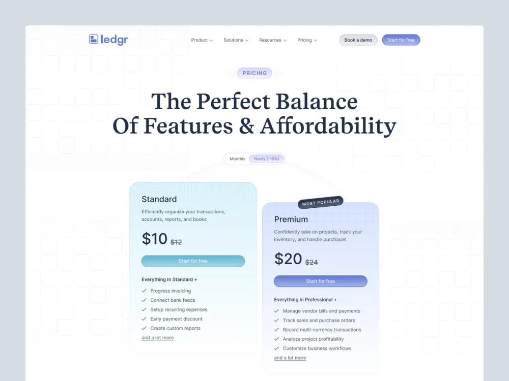 All Prompts
skill
Web App / Pricing Page
Шаблон и чек-лист для создания конверсионной страницы цен SaaS: структура, дизайн планов, копирайтинг, SEO, FAQ, паттерны.
by Zhou Jason
Prompt
# Web App / Pricing Page

Design a pricing page that helps visitors **choose** and feel good about it.
Your job is not to “show prices.”
Your job is to **reduce uncertainty**.

## Before you design/write
Gather (ask if missing):

### 1) Offer + audience
- What are you selling? (category)
- Who is it for? (ICP + primary use case)
- What’s the main value metric? (seat, usage, project, revenue, etc.)

### 2) Plans
- Plan names + prices (monthly/annual)
- Limits per plan (the 3–6 limits that matter)
- What’s the upgrade trigger? (what causes people to move up?)

### 3) Objections + risk
- Top 3 reasons people don’t buy today
- Security/compliance needs? (SOC2, GDPR, etc.)
- Can you offer: free trial, free plan, money-back, demo?

### 4) Proof
- Testimonials, logos, results, case studies, metrics

### 5) Traffic context
- Are visitors coming from: homepage, feature pages, ads, comparison pages?
- What do they already know?

---

## Core structure (what a pricing page should have)

### Above the fold (must)
- **Clear value headline** (what outcome, for who)
- **Monthly/Annual toggle** with annual savings callout
- **3‑plan pricing table** (most common) or 2‑plan (simple product)
- **Primary CTA** per plan (consistent verbs)

### Below the fold (high leverage)
- **Plan comparison** (feature matrix or “what you get” bullets)
- **FAQ** (objection handling)
- **Social proof** near decision points
- **Security / compliance / procurement** section (if B2B)
- **Final CTA** + contact sales

---

## Layout types (pick one)

### A) Classic 3‑card
Best when:
- you have 3 natural tiers (Starter / Pro / Business)
- pricing is simple

Rules:
- 1 plan labeled **Recommended**
- show “most popular” without yelling

### B) Value metric slider
Best when:
- pricing scales with usage (seats, events, credits)

Rules:
- keep math obvious
- keep a safe default (median customer)

### C) “Pick your path” (two columns)
Best when:
- different audiences (Individuals vs Teams)

Rules:
- separate by persona first, then price

### D) Enterprise last mile
Best when:
- you have a self-serve path + sales-led path

Rules:
- Enterprise should read like **procurement reassurance**

---

## High‑conversion strategies (practical)

### 1) Make the decision easy
- 3 plans max (unless you have a strong reason)
- One recommended plan
- Bullets describe **outcomes**, not internal features

### 2) Anchor value (without being shady)
- Annual toggle with “Save X%”
- Show “Starting at” only if your pricing is truly variable
- Avoid surprise fees

### 3) Reduce risk
Choose at least one:
- Free trial
- Free plan
- Money‑back guarantee
- “Talk to sales” with a clear promise (response time, demo)

### 4) Handle objections before they bounce
Most effective FAQ topics:
- “Can I cancel anytime?”
- “What happens if I hit limits?”
- “Do you offer discounts?”
- “Is this for freelancers/teams?”
- “Security / data / compliance”

### 5) Provide a comparison that’s readable
- Avoid huge spreadsheets
- Group by: Core, Collaboration, Admin/Security, Support
- Highlight what changes at each tier

---

## Copywriting (templates)

### Headlines (choose a formula)
- “{Outcome} for {audience}—without {pain}”
- “Plans that scale from {small} to {big}”
- “Start small. Upgrade when {trigger}.”

### Plan description (2 lines)
- Who it’s for
- What it unlocks

Example:
- **Pro** — For designers shipping weekly. Better components, faster iteration.

### CTA buttons
Rules:
- Use verbs that match the motion:
  - “Start free trial”
  - “Buy Pro”
  - “Contact sales”
- Keep CTAs consistent across plans (don’t mix “Get started” / “Try now” / “Sign up”).

### Feature bullets (write like outcomes)
- ❌ “Unlimited projects”
- ✅ “Ship unlimited client sites without extra fees”

---

## Pricing table checklist (UI)
- Visible monthly/annual toggle
- “Save X%” callout on annual
- Recommended plan styling (subtle)
- Key limits visible (3–6 max)
- Included items visible (3–6 max)
- Clear next step under each plan (trial/buy/contact)
- Link: “Compare plans” (scrolls to matrix)
- Mobile: table becomes stacked cards (not a horizontal scroll nightmare)

---

## SEO + AEO (AI answers) checklist

### SEO basics
- Title: “Pricing — {Product}” + outcome keyword
- Meta description: 1 sentence on value + 1 sentence on pricing starting point
- Clean URL: `/pricing`
- Internal links from:
  - homepage CTA
  - feature pages
  - comparison pages

### AEO (answer engines)
- Add an FAQ section that answers:
  - refund policy
  - trial length
  - cancellation
  - what counts as a seat/usage
  - enterprise procurement
- Write FAQs in **plain Q/A** format.
- Optional: FAQ schema (if your stack supports it).

---

## Common pitfalls
- Too many plans (analysis paralysis)
- Features listed with no context (why it matters)
- Pricing hidden behind “Contact sales” for everything
- Switching value metric mid-page (confusing)
- Over-designed table that harms readability

---

## Output format (when generating a pricing page)
Return:
1) **Page outline** (sections + order)
2) **Pricing table spec** (plans, bullets, limits, CTA)
3) **FAQ list** (6–12 Q/A)
4) **SEO/AEO** (title + meta + FAQ schema suggestion)
5) **Layout recommendation** (A/B/C/D + why)

---

## Quick questions (if user gives you only “make a pricing page”)
- Free plan or trial?
- Monthly/annual pricing numbers?
- Value metric?
- Recommended plan (which one and why)?
- Top 3 objections?