All Prompts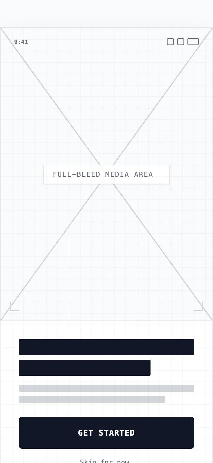 All Prompts
mobile applayout
Welcome screen
UI-компонент: Welcome screen. Минималистичный мобильный онбординг в grayscale. Для SaaS, fintech. Структура: визуал, текст, кнопка. Фокус на ясности.
by Shirley LouLive Preview
Prompt
# Welcome screen

{
  "summary": "A minimalist, mobile-first onboarding interface designed for modern app experiences. It utilizes a high-fidelity wireframe approach with a clean neutral color palette, bold Satoshi typography, and a structured layout that prioritizes high-impact visuals and clear call-to-action buttons within the mobile safe zone.",
  "style": {
    "description": "The style is 'Minimalist Hi-Fi Wireframe'. Typography uses 'Satoshi' for a modern, geometric feel; headings are bold and sized around 32px, while body text uses 14-16px with tight line-height. The color scheme is monochrome: pure white (#FFFFFF) backgrounds, deep neutral-900 (#171717) for primary text and buttons, and light neutral-200 (#E5E7EB) for secondary accents and borders. Subtle depth is added via backdrop-blur (12px) and soft shadows (rgba(0,0,0,0.1)).",
    "prompt": "Create a mobile-first UI with a clean, high-fidelity wireframe aesthetic. \n- **Typography**: Use 'Satoshi' as the primary typeface. Headings: 700 weight, 32px. Subtext: 400 weight, 14px, color: #737373. \n- **Colors**: Primary Background: #FFFFFF. Accents: #F9FAFB. Text/Primary Button: #171717. Secondary Elements: #E5E7EB. \n- **Buttons**: Primary CTA should be 60px height, rounded-2xl (16px radius), with a subtle #000000 10% shadow. \n- **Micro-interactions**: Implement a scale-down effect (scale: 0.98) for button active states. \n- **Overlays**: Use a very subtle 24px dot or line grid overlay at 2% opacity for a technical feel. \n- **Placeholders**: Visual containers should feature a 'Wireframe X' pattern using diagonal lines (#E5E7EB) and centered Lucide icons."
  },
  "layout_and_structure": {
    "description": "A vertical stack optimized for mobile viewports, divided into three distinct zones: Top (Visual), Middle (Content), Bottom (Action).",
    "prompts": [
      {
        "part": "Device Mockup Frame",
        "prompt": "For desktop viewing, wrap the interface in a device mockup with a width of 390px and height of 844px. Include a centered 'Dynamic Island' (w-28, h-7, black, rounded-full) at the top. The frame should have a 48px corner radius and a 12px dark border (#171717) with a deep outer shadow."
      },
      {
        "part": "Status Bar & Header",
        "prompt": "A 48px high header containing a digital clock (13px, font-bold) on the left and signal/wifi/battery icons on the right. Maintain a horizontal padding of 32px (px-8)."
      },
      {
        "part": "Visual Hero Section",
        "prompt": "The top 55-60% of the screen is a full-bleed visual placeholder. Implement a 'Wireframe X' background (diagonal lines crossing at center). In the center, place a white pill label with 12px backdrop-blur, 10px bold uppercase tracking-widest text, and a gray icon. Add a white gradient fade at the bottom of this section to transition into the text area."
      },
      {
        "part": "Content Area",
        "prompt": "A centered text container with 32px horizontal padding. Use heavy weight 32px text placeholders for headlines (rounded rects) and 14px rounded lines for body text descriptions. Ensure a vertical gap of 16px between headline and body."
      },
      {
        "part": "Sticky Footer",
        "prompt": "A fixed-bottom footer containing a single full-width primary button (60px height) followed by a text-only 'Skip' link. Include a 'Home Indicator' pill (w-32, h-1.5, #E5E7EB) centered at the very bottom with a 24px safe-area-inset."
      }
    ]
  },
  "special_ui_components": [
    {
      "component": "Wireframe Visual Placeholder",
      "description": "A sophisticated geometric placeholder for hero images.",
      "prompt": "Create a container with a background composed of two linear gradients: one 'to top right' and one 'to bottom right', both 1px thick and #E5E7EB color, meeting at the center to form an 'X'. Apply a background color of #FCFCFC. Center an icon and a pill-shaped badge (bg-white/80, backdrop-blur-md) on top."
    },
    {
      "component": "Interactive Action Button",
      "description": "The primary high-contrast CTA.",
      "prompt": "Design a button with height: 60px, width: 100%, background: #171717, border-radius: 16px. Typography: White, Satoshi Bold, 16px. Add a shadow-lg using a soft neutral tint. Implementation must include a CSS transition: 'active:scale-95' and 'duration-200' for tactile feedback."
    }
  ],
  "special_notes": "MUST maintain the 60px height for primary buttons to ensure high tap-accuracy on mobile. MUST use env(safe-area-inset-bottom) for footer positioning to prevent overlap with OS-level navigation. DO NOT use vibrant colors; stick to the grayscale palette to maintain the wireframe integrity. MUST ensure all text placeholders have rounded corners to match the UI softness."
}