All Prompts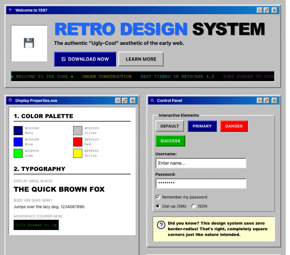 All Prompts
style
Win98
Стиль Win98 для UI. Воссоздает эстетику раннего веба для дизайна сайтов и приложений.
by Zhou JasonLive Preview
Prompt
# Win98

<design-system>

# Retro / 90s Nostalgia Design System

## Design Philosophy

**Core Principles**: Embrace the raw, unfiltered aesthetic of the early web. This design celebrates the "ugly-cool" charm of 1990s websites—beveled buttons, system fonts, garish colors, and animated elements. It's deliberately anti-modern, rejecting minimalism in favor of maximum visual impact and nostalgic authenticity. Every pixel should feel like it was crafted in 1997 on a Windows 95 machine.

**Vibe**: Playful, chaotic, nostalgic, and unapologetically loud. Think GeoCities pages, "Under Construction" banners, hit counters, and guestbooks. This isn't about looking dated—it's about capturing the optimistic, experimental spirit of the early internet when everyone was just figuring things out. The aesthetic should feel authentic enough that someone who lived through the era would smile with recognition.

**Historical Context**: This style peaked between 1995-1999, when personal computers used Windows 95/98, monitors were 800x600 resolution, and web browsers offered limited CSS. Designers worked within severe constraints, which produced a distinctive visual language we're faithfully recreating.

---

## Design Token System (The DNA)

### Colors (Light Mode Only)

This palette is pulled directly from Windows 95 system colors and early web hex values.

| Token | Value | Usage | Notes |

|-------|-------|-------|-------|

| `background` | `#C0C0C0` | Primary page background | Classic Windows 95 button face gray |

| `foreground` | `#000000` | Pure black text | Maximum contrast, no grays for body text |

| `muted` | `#808080` | Secondary elements, metadata | Exactly 50% gray (128,128,128) |

| `accent` | `#0000FF` | Hyperlinks (unvisited) | Pure blue at maximum saturation |

| `secondary` | `#FF0000` | Hot red for emphasis | Pure red at maximum saturation |

| `tertiary` | `#FFFF00` | Bright yellow highlights | Pure yellow, used for badges and highlights |

| `success` | `#00FF00` | Lime green | Pure green at maximum saturation |

| `successDark` | `#00AA00` | Darker green for buttons | More readable green variant |

| `border` | `#000000` | Pure black borders | Used for outer borders |

| `borderLight` | `#FFFFFF` | White for 3D highlight | Top/left bevel edge |

| `borderDark` | `#808080` | Gray for 3D shadow | Bottom/right bevel edge |

| `titleBar` | `#000080` | Windows title bar navy | Pure dark blue (Navy) |

| `titleBarGradientEnd` | `#1084D0` | Title bar gradient | Windows 98 active window gradient |

| `panelYellow` | `#FFFFCC` | Light yellow content panels | Authentic Windows notepad/help color |

| `visitedLink` | `#800080` | Visited hyperlinks | Purple/Maroon |

| `hoverLink` | `#FF0000` | Link hover state | Red |

**Color Relationships**:

- All colors are at maximum saturation (pure RGB values with at least one channel at 0 or 255)

- No gradual grays - only `#000000`, `#808080`, `#C0C0C0`, `#FFFFFF`

- Links follow the classic progression: Blue → Purple (visited) → Red (hover)

### Typography

**Font Stacks** (System fonts that evoke 1995-1999):

- **Primary Body**: `"MS Sans Serif", "Segoe UI", Tahoma, Geneva, Verdana, sans-serif`

- **Headings**: `"Arial Black", Impact, Haettenschweiler, sans-serif` (heavy, bold weights only)

- **Monospace**: `"Courier New", Courier, monospace` (for dates, stats, counters, code-like elements)

- **Playful accent** (ultra-sparingly): `"Comic Sans MS", cursive` (only for "fun" decorative elements if needed)

**Type Scale**:

- **H1 Hero**: 48px-96px (3xl to 6xl), always UPPERCASE or Title Case, Arial Black/Impact

- **H2 Section**: 32-48px (2xl to 4xl), often UPPERCASE, Arial Black

- **H3 Subsection**: 20-24px (lg to xl), bold weight

- **Body**: 14-16px, default weight, readable density

- **Small/Meta**: 12px (xs), often monospace for dates and metadata

- **Labels**: 10-12px, UPPERCASE, sometimes monospace

**Typographic Patterns**:

- Headings are BOLD or BLACK weight - no thin or light fonts exist in this era

- Letter-spacing on UPPERCASE headings: `tracking-tight` to `tracking-wide` (not expanded)

- Line-height: Dense (1.2-1.4 for headings, 1.5-1.6 for body)

- Text shadows for 3D text: `text-shadow: 2px 2px 0 #808080` (hard-edged, no blur)

### Radius & Borders

**Border Radius**: `0px` EVERYWHERE. No exceptions. The 90s didn't have border-radius.

**Border Widths**:

- Standard: `2px` for most elements

- Emphasis: `4px` for section dividers and highlighted elements

- Minimum: `1px` only for subtle inner detail (rare)

**3D Bevel Effect** (THE SIGNATURE):

This is the most critical visual element. Windows 95 used a specific 4-value border-color syntax combined with box-shadow for depth.

**Outset (Raised) - Elements that appear to pop out**:

~~~css

border: 2px solid;

border-color: #ffffff #808080 #808080 #ffffff; /* Top Right Bottom Left */

box-shadow: inset -1px -1px 0 #404040, inset 1px 1px 0 #dfdfdf;
~~~

- Top and left edges: white (#ffffff)

- Bottom and right edges: gray (#808080)

- Inner shadow adds depth with darker (#404040) and lighter (#dfdfdf) accents

**Outset Enhanced (Deeper bevel)**:

~~~css

border: 2px solid;

border-color: #ffffff #808080 #808080 #ffffff;

box-shadow:

inset -2px -2px 0 #808080,

inset 2px 2px 0 #fff,

inset -4px -4px 0 #404040,

inset 4px 4px 0 #dfdfdf;
~~~

**Inset (Sunken) - Elements that appear pressed in**:

~~~css

border: 2px solid;

border-color: #808080 #ffffff #ffffff #808080; /* REVERSED from outset */

box-shadow: inset 1px 1px 0 #404040, inset -1px -1px 0 #dfdfdf;
~~~

- Top and left edges: gray (#808080)

- Bottom and right edges: white (#ffffff)

- Inner shadow creates recessed appearance

**Active/Pressed State**:

When an outset element is clicked, it becomes inset AND translates 1px down and right:

~~~css

border-color: #808080 #ffffff #ffffff #808080;

box-shadow: inset 1px 1px 0 #404040, inset -1px -1px 0 #dfdfdf;

transform: translate(1px, 1px);
~~~

**Tailwind Implementation**:

Use arbitrary values with underscores for spaces:

- `[border-color:#fff_#808080_#808080_#fff]` for outset

- `[border-color:#808080_#fff_#fff_#808080]` for inset

- `[box-shadow:inset_-1px_-1px_0_#404040,inset_1px_1px_0_#dfdfdf]`

### Textures & Patterns (MANDATORY)

The background must NOT be flat. This is critical for authenticity.

**90s Tiled Pattern** (Primary technique):

~~~css

background-color: #c0c0c0;

background-image:

linear-gradient(45deg, #b8b8b8 25%, transparent 25%),

linear-gradient(-45deg, #b8b8b8 25%, transparent 25%),

linear-gradient(45deg, transparent 75%, #b8b8b8 75%),

linear-gradient(-45deg, transparent 75%, #b8b8b8 75%);

background-size: 4px 4px;

background-position: 0 0, 0 2px, 2px -2px, -2px 0px;
~~~

This creates a subtle diagonal crosshatch that gives texture without being distracting.

**Construction Warning Stripes** (For emphasis areas):

~~~css

background: repeating-linear-gradient(

45deg,

#ffff00,

#ffff00 10px,

#000000 10px,

#000000 20px

);
~~~

Exactly 10px yellow, 10px black stripes at 45-degree angle.

**Horizontal Rule (HR) with Groove Effect**:

~~~css

border: none;

height: 4px;

background: linear-gradient(

to bottom,

#808080 0%, #808080 50%,

#ffffff 50%, #ffffff 100%

);
~~~

Creates the classic "etched" divider look.

---

## Component Styling Principles

### Buttons

**Visual Requirements**:

- Border: 2px with 4-value outset color pattern

- Background: Subtle gradient or solid color depending on variant

- Text: Bold, UPPERCASE with `tracking-wide`, centered

- Padding: 8px vertical, 16px horizontal (comfortable clickable area)

- NO border-radius

- NO soft drop shadows

**State Transitions**:

- **Default**: Outset bevel, slightly lighter background on hover

- **Hover**: Background lightens by 1-2 shades, maintain outset

- **Active/Pressed**: Inset bevel (reversed border-color), translate(1px, 1px)

- **Focus**: Dotted 2px black outline, 2px offset (Windows 95 focus ring)

- **Transition**: NONE or instant `transition-none` or 50ms max) - no smooth easing

**Variants**:

1. **Default/Ghost**: `#C0C0C0` background, black text, outset bevel

2. **Accent/Primary**: `#0000FF` background, white text, blue-tinted bevel edges

3. **Danger**: `#FF0000` background, white text, red-tinted bevel edges

4. **Success**: `#00AA00` (readable green) background, white text, green-tinted bevel

5. **Outline**: White background, black text, outset bevel

**Bevel Color Tinting**:

For colored buttons, tint the bevel edges to match:

- Blue button: `border-color: #5555ff #000080 #000080 #5555ff`

- Red button: `border-color: #ff5555 #800000 #800000 #ff5555`

- Green button: `border-color: #00ff00 #006600 #006600 #00ff00`

**Example Tailwind Classes**:

~~~

border-2

bg-[#c0c0c0]

text-black

[border-color:#fff_#808080_#808080_#fff]

[box-shadow:inset_-1px_-1px_0_#404040,inset_1px_1px_0_#dfdfdf]

hover:bg-[#d0d0d0]

active:[border-color:#808080_#fff_#fff_#808080]

active:[box-shadow:inset_1px_1px_0_#404040,inset_-1px_-1px_0_#dfdfdf]

active:translate-x-[1px]

active:translate-y-[1px]

focus-visible:outline-dotted

focus-visible:outline-2

focus-visible:outline-black

focus-visible:outline-offset-2
~~~

### Cards/Containers

**Panel/Card Structure**:

- Container: 2px outset bevel, `#C0C0C0` background

- Title bar: Gradient `linear-gradient(to right, #000080, #1084d0)`, white text, bold, 4-8px padding

- Content area: Inset bevel (sunken), white or `#FFFFCC` (yellow) background

**Window-Style Card** (Most distinctive):

~~~

Outer container: outset bevel, gray background

├── Title bar: navy gradient (#000080 → #1084d0), white bold text

└── Content area: inset bevel, white background, padding 16px
~~~

**Alternating Row Backgrounds**:

For table-like layouts, alternate between:

- Even rows: `#FFFFFF` (white)

- Odd rows: `#E8E8E8` (light gray)

This creates the classic spreadsheet/database appearance.

**Borders Between Cells**:

Use `border-right-2` and `border-bottom-2` with `#808080` to create visible grid lines.

### Form Inputs

**Input Fields**:

- Border: 2px inset (sunken appearance)

- Background: White

- Text: Black, 14-16px

- Padding: 4-8px

- Focus: Dotted 2px black outline, 2px offset

- Disabled: `#C0C0C0` background, 50% opacity

**Placeholder Text**: `#808080` (gray)

**Select Dropdowns**: Same inset styling as inputs

**Checkboxes/Radio**: Not common in 90s web (use text indicators or simple squares)

### Links (Hyperlinks)

The most iconic element of the 90s web.

**States**:

- **Unvisited**: `#0000FF` (blue), underlined always

- **Visited**: `#800080` (purple)

- **Hover**: `#FF0000` (red)

- **Active** (while clicking): `#FF0000` (red)

**Rules**:

- ALWAYS underlined (never remove text-decoration)

- Color changes are instant (no transitions)

- No background on hover

- No additional styling effects

**Example**:

~~~

text-[#0000ff]

underline

hover:text-[#ff0000]

visited:text-[#800080]
~~~

### Icons

**Styling**:

- Stroke width: `2px` or `stroke-[2px]` (thick, bold lines)

- Color: Match the accent color of the section (blue, red, green)

- Size: 24px (h-6 w-6) standard, 32px for features

- NO rounded corners or soft shapes

- Consider adding 2px black borders around icon containers

**Icon Containers**:

If placing icons in colored boxes:

- Box background: Solid bright color (#000080, #008080, #00AA00)

- Icon color: White

- Box style: Outset or flat with borders

---

## Layout Principles

### Page Structure

**Maximum Width**: `max-w-5xl` (1024px) - mimics 800x600 monitor content area with browser chrome

**Spacing System**:

- Base unit: 8px

- Element padding: 16px (generous interior spacing)

- Element margins: 8-16px (tighter exterior spacing for density)

- Section padding: 64px vertical (py-16), 16px horizontal (px-4)

**Section Dividers**:

Use thick borders `border-b-4 border-[#808080]`) OR the groove HR effect between major sections.

**Grid Layouts**:

Even though using modern CSS Grid/Flexbox, make it LOOK like tables:

- Visible cell borders with `border-2` or `border-r-2border-b-2`

- Alternating row backgrounds

- Equal column widths where possible

- Dense, compact spacing

### Responsive Strategy

**Desktop** (768px+):

- Full table-like layouts with side-by-side columns

- Multi-column grids (2-4 columns)

- Visible complex borders

**Tablet** (640-768px):

- Reduce to 2 columns max

- Maintain all visual styling (bevels, borders)

- Stack complex tables if needed

**Mobile** (<640px):

- Single column

- KEEP beveled effects (essential to the style)

- Marquee continues to scroll

- Reduce font sizes slightly but keep bold weights

- Horizontal scrolling for complex tables is acceptable (authentic!)

**Important**: The aesthetic is more important than perfect responsiveness. It's okay if the mobile experience is slightly janky—that's authentic to the era.

---

## The "Bold Factor" (Non-Genericness)

**MANDATORY ELEMENTS** - These must be present or the style fails:

### 1. Marquee Scrolling Text

Use `react-fast-marquee` or pure CSS marquee for:

- Announcement bars with colorful text

- Testimonial carousels

- "Breaking news" style updates

**Settings**:

- Speed: 30-60 (moderate pace)

- No gradient fade (gradient={false})

- Multiple spans with different colors

### 2. Animated Rainbow Text

CSS animation cycling through bright colors for hero headlines:

~~~css

@keyframes rainbow {

0% { color: #ff0000; }

17% { color: #ff8000; }

33% { color: #ffff00; }

50% { color: #00ff00; }

67% { color: #0080ff; }

83% { color: #8000ff; }

100% { color: #ff0000; }

}

animation: rainbow 4s linear infinite;
~~~

**Duration**: 4 seconds, linear easing (no smoothing)

### 3. Beveled Everything

Every interactive element and most containers must have the 3D outset/inset effect. This is NON-NEGOTIABLE.

### 4. "Under Construction" Energy

Add small animated elements:

- Blinking "NEW!" badges (use `animate-pulse` or CSS blink with step-end)

- Pulsing call-to-action badges

- Color-cycling decorative elements

**Pulse Glow Animation** (for badges):

~~~css

@keyframes pulse-glow {

0%, 100% {
~~~

transform: scale(1);

box-shadow: 0 0 0 0 rgba(255, 0, 0, 0.7);

~~~

}

50% {
~~~

transform: scale(1.05);

box-shadow: 0 0 10px 2px rgba(255, 0, 0, 0.5);

~~~

}

}

animation: pulse-glow 1.5s ease-in-out infinite;
~~~

### 5. Horizontal Rules (HR) as Dividers

Use the 3D groove effect between major content sections. This is a signature 90s pattern.

### 6. Hit Counter Aesthetic

Style at least one stats section like a classic hit counter:

- Black or navy background

- Green monospace text (#00FF00)

- Beveled inset frame

- Text like "Visitors: 0001234 | Since 1995"

### 7. Table-Like Visual Layouts

Even when using modern CSS, create the appearance of HTML tables:

- Visible cell borders `border-2 border-[#808080]`)

- Alternating row backgrounds

- Grid-like precision

### 8. Title Bar Windows

Cards should look like Windows 95 application windows:

- Navy-to-blue gradient title bar

- White bold text in title

- Inset content area below

### 9. Decorative Color Squares

Include at least one section with a grid of bright colored squares (red, green, blue, yellow, magenta, cyan) with beveled edges. This is pure decorative 90s excess.

### 10. Construction Stripe Background

Use the yellow/black diagonal stripe pattern for at least one emphasized section (like final CTA).

---

## Animation & Motion

**Motion Philosophy**: Snappy, immediate, digital. No organic easing curves.

**Timing Functions**:

- **Instant state changes**: `transition-none` or `duration-0`

- **Color cycling**: `linear` (no easing)

- **Badges/pulses**: `ease-in-out` (acceptable for attention effects)

- **Button press**: `transition-none` or max 50ms

**Durations**:

- Button press: Instant or 50ms

- Hover color change: 75ms or instant

- Rainbow text cycle: 3-5 seconds

- Pulse glow: 1-2 seconds

- Marquee speed: Moderate (40-60px/second)

**Key Animations**:

1. **Rainbow Text**: 4s linear infinite loop through spectrum

2. **Pulse Glow**: 1.5s ease-in-out infinite for "NEW!" badges

3. **Blink** (ultra-sparingly): 1s step-end infinite (harsh on/off, not fade)

4. **Marquee**: Continuous scroll, pauseOnHover for usability

**Reduced Motion**:

Respect `prefers-reduced-motion`:

- Stop rainbow animation (fallback to single bright color)

- Stop marquee (show static or slower scroll)

- Stop pulsing badges (static with bright color)

---

## Accessibility

**Color Contrast**:

- Black (#000000) on silver (#C0C0C0): 7.5:1 (AAA)

- White on navy (#000080): 8.6:1 (AAA)

- White on blue (#0000FF): 8.6:1 (AAA)

- The palette naturally provides excellent contrast

**Focus States**:

- 2px dotted black outline (Windows 95 authentic)

- 2px offset from element

- High visibility, matches the aesthetic

- NEVER remove focus indicators

**Keyboard Navigation**:

- All interactive elements must be keyboard accessible

- Tab order should follow visual order

- Button press on Enter/Space should show active state

**Screen Readers**:

- Marquee text must have static alternative or be aria-live="polite"

- Decorative animated elements should be aria-hidden

- Color squares and decorative patterns need no alt text

- Ensure semantic HTML even with table-like appearance

**Motion Sensitivity**:

Provide `prefers-reduced-motion` alternatives:

~~~css

@media (prefers-reduced-motion: reduce) {

.text-rainbow { animation: none; color: #ff0000; }

.animate-pulse-glow { animation: none; }

/* Marquee handled by library or CSS */

}
~~~

---

## Anti-Patterns (What to AVOID)

### Visual No-Nos:

1. **NO border-radius** - Not even 1px. Zero. Always.

2. **NO soft drop shadows** - Only use inset shadows for bevels

3. **NO gradients** except:

- Title bar gradient (navy to blue)

- Background patterns (stripes, tiles)

- Subtle button backgrounds

 4. **NO semi-transparent overlays** - Colors are always opaque (except white/80 for secondary text on dark backgrounds)

 5. **NO thin fonts** - Everything is bold or black weight

 6. **NO subtle grays** - Only #000000, #808080, #C0C0C0, #FFFFFF, #E8E8E8

 7. **NO smooth easing** - Use linear or instant transitions

 8. **NO removing link underlines** - Always visible

 9. **NO modern minimalist spacing** - Dense, not airy

10. **NO attempting to "modernize" the aesthetic** - Embrace the cheese

### Interaction No-Nos:

1. **DON'T use hover states that scale elements** (except 1.05 for pulse badges)

2. **DON'T use fade transitions** - Changes should be instant or linear

3. **DON'T make marquee text essential content** - Keep it decorative/supplemental

4. **DON'T override browser default selection color** - Actually, DO: use #000080 background, white text

5. **DON'T use floating action buttons** or modern UI patterns

### Content No-Nos:

1. **DON'T use placeholder text** that doesn't fit the era (no "lorem ipsum")

2. **DON'T reference modern tech** in decorative text (keep it generic or 90s-themed)

3. **DON'T be subtle** - This style is LOUD and PROUD

---

## Implementation Notes

### Tailwind Arbitrary Values

You'll use these constantly:

~~~

border-[2px]

[border-color:#fff_#808080_#808080_#fff]

[box-shadow:inset_-1px_-1px_0_#404040,inset_1px_1px_0_#dfdfdf]

bg-[#c0c0c0]

text-[#0000ff]
~~~

Note: Use underscores for spaces in arbitrary values.

### Custom CSS Required

Some effects need CSS files:

- `@keyframes` for rainbow, pulse-glow, blink

- `.hr-groove` for horizontal rule effect

- `.bg-90s-tile` for tiled background pattern

- `.bg-construction` for warning stripes

### Dependencies

- **react-fast-marquee**: Essential for authentic scrolling text

- Consider creating CSS variables for the complex box-shadow values for reusability

### Color Layering Strategy

1. **Base**: Tiled #C0C0C0 background

2. **Surface**: White or gray (#E8E8E8) panels with bevels

3. **Accent surfaces**: Navy title bars, colored feature boxes

4. **Foreground**: Black text, colored icons

5. **Highlights**: Yellow badges, red "NEW!" tags, rainbow text

---

## Signature Visual Checklist

Before considering the design complete, verify these are present:

- [ ] At least one marquee scrolling element with colorful text

- [ ] Rainbow animated text on hero or major heading

- [ ] All buttons have 3D outset bevels with proper border-color syntax

- [ ] At least one card with Windows 95 title bar gradient

- [ ] Tiled background pattern visible on main body

- [ ] Hyperlinks are blue/underlined, turn red on hover

- [ ] At least one section with alternating row backgrounds

- [ ] Horizontal groove rule divider between major sections

- [ ] A "hit counter" style stats display with monospace green text

- [ ] One "NEW!" or "HOT!" badge with pulse animation

- [ ] Construction stripe background on at least one section

- [ ] All interactive elements have dotted focus outlines

- [ ] Active buttons show pressed state (inset + translate)

- [ ] Icons have 2px stroke width

- [ ] Zero instances of border-radius anywhere

---

## The Secret Sauce

What makes this style work is **commitment to authenticity over modernization**. The temptation will be to "clean it up" or "make it more professional." Resist this. The ugliness IS the beauty. The clashing colors, the dense layouts, the aggressive animations—these aren't bugs, they're features.

Someone who lived through 1997 should look at this and immediately feel transported back. The design should be so authentic that it's almost jarring next to modern websites. That contrast IS the point.

Embrace the cheese. Celebrate the chaos. Welcome to 1997.

</design-system>