All Prompts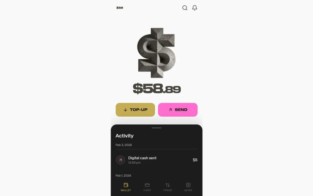 All Prompts
ZAR Wallet Dashboard - Exact Match
Мобильная дашборд ZAR Wallet: нео-брутализм, светлая/темная темы, золото/розовый. Для криптокошельков, необанков, финтех-приложений.
by Sebastian SchollLive Preview
Prompt
# ZAR Wallet Dashboard - Exact Match

{
  "summary": "A sophisticated mobile wallet UI (375px width) that uses a dual-tone layout. The top half is light grey (#F9F9F9) featuring a central 3D asset and massive display typography, while the bottom half is a dark charcoal (#1C1C1C) slide-up style activity list with rounded corners and high-contrast action buttons.",
  "style": {
    "description": "The style is defined by its typography pairing: a heavy extended sans-serif (EK Modena HeavyExtended) for headings and a clean geometric sans (Baikal) for body text. The color scheme uses '#C4AD54' (Muted Gold) and '#FF6ECE' (Vivid Pink) against a background of '#F9F9F9' and '#1C1C1C'. Animations are snappy with subtle micro-interactions like scale-95 on touch.",
    "prompt": "### Visual Theme\n- **Base Colors:** Light Background `#F9F9F9`, Dark Section `#1C1C1C`, Secondary Dark `#2A2A2A`.\n- **Accent Colors:** Primary Gold `#C4AD54`, Secondary Pink `#FF6ECE`.\n- **Typography:** \n    - **Display:** EK Modena HeavyExtended (heavy weight, wide tracking, uppercase for UI controls).\n    - **Body:** Baikal Regular/Medium (clean sans-serif).\n    - **Monospace:** EK Modena Mono-Medium for values.\n- **Borders & Radius:** \n    - Main sections: `border-top-radius: 24px`.\n    - Action buttons: `border-radius: 16px` (2xl).\n- **Shadows:** Use a soft upward shadow for the dark section: `0px -20px 40px rgba(0,0,0,0.1)`.\n- **Micro-Interactions:** All interactive elements should have `active:scale-95` with a `transition: all 0.2s ease-in-out` effect."
  },
  "layout_and_structure": {
    "description": "A vertical stack starting with a minimalist header, followed by a hero area for visuals and balance, a twin action-button row, a slide-up activity panel, and a fixed bottom navigation bar.",
    "prompts": [
      {
        "part": "Header",
        "prompt": "### Header\n- **Layout:** Flex row with `justify-between`, `px-5`, `py-4`.\n- **Content:** Brand logo on the left (h-8), empty flex gap on the right for potential profile/menu items."
      },
      {
        "part": "Hero Section",
        "prompt": "### Hero & Balance Area\n- **Layout:** Flex column centered, `pt-2`, `pb-8`.\n- **Visual:** A large central container (w-64 h-64) housing a 3D rock/concrete dollar illustration.\n- **Balance Display:** Text color `#47433C`. Primary amount in `font-display` at `52px` font-size. Decimals in `40px` within the same line. Tracking should be `tighter` with `leading-none`."
      },
      {
        "part": "Action Row",
        "prompt": "### Action Row\n- **Layout:** Flex row with `gap-3`, `px-5`, `mt-8`.\n- **Button A (Top-Up):** Background `#C4AD54`, height `56px`, rounded `16px`. Icon 'lucide:arrow-down' and 'TOP-UP' text in `font-display` (size: 14px).\n- **Button B (Send):** Background `#FF6ECE`, height `56px`, rounded `16px`. Icon 'lucide:arrow-up-right' and 'SEND' text in `font-display` (size: 14px).\n- **Interaction:** Both buttons use `active:scale-95`."
      },
      {
        "part": "Activity Section",
        "prompt": "### Dark Activity Panel\n- **Container:** Background `#1C1C1C`, `border-top-left-radius: 24px`, `border-top-right-radius: 24px`, `px-5`, `pt-3`, `pb-24`.\n- **Handle:** A centered pill-shaped pull bar `w-10 h-1`, color `#4A4A4A`, `mb-4`.\n- **Content:** 'Activity' heading in white `font-medium` (20px).\n- **List Items:** Grouped by date. Date header in `#A0A0A0` (12px) with a bottom border `#3A3A3A`.\n- **Transactions:** Flex row with icon circle (`#2A2A2A`), title in white (15px), and timestamp in grey (12px). Amount on the right."
      },
      {
        "part": "Bottom Navigation",
        "prompt": "### Bottom Navigation\n- **Layout:** Fixed bottom bar, `h-[72px]`, background `#1C1C1C`, `z-50`.\n- **Items:** 4 evenly spaced links. Active item uses Gold `#C4AD54`, inactive items use Grey `#606060`.\n- **Structure:** Icon on top, 10px uppercase text below with `tracking-wider`."
      }
    ]
  },
  "special_ui_components": [
    {
      "component": "Ghost Transaction Item",
      "description": "A locked or pending state for list items that feels interactive but distinct.",
      "prompt": "### Ghost Item Style\n- **Background:** Transparent by default, shifts to `#2A2A2A` on click/active.\n- **Icon:** Use 'lucide:lock' icon in a `#2A2A2A` circular container.\n- **Typography:** Primary text in white, secondary text in `#606060` with a transition to `#808080` on hover.\n- **Spacing:** `px-2`, `-mx-2` (negative margin) to allow the hover background to expand past the content alignment."
    },
    {
      "component": "Balance Typography",
      "description": "Specific styling for the financial balance to ensure readability and impact.",
      "prompt": "### Balance Component\n- **Main Font:** EKModena-HeavyExtended.\n- **Main Size:** 52px.\n- **Cents/Decimals:** Nested span at 40px.\n- **Color:** `#47433C` (a warm dark charcoal).\n- **Alignment:** Center aligned with a `margin-top: -8px` to pull it closer to the hero graphic above."
    }
  ],
  "special_notes": "Maintain strict adherence to the font pairings—the heavy extended font is critical for the 'neo-brutalist' feel. Ensure the 'Activity' section has a large padding-bottom (pb-24) so content isn't obscured by the fixed navigation bar. Do not use standard system fonts; use the specified geometric and display faces."
}