All Prompts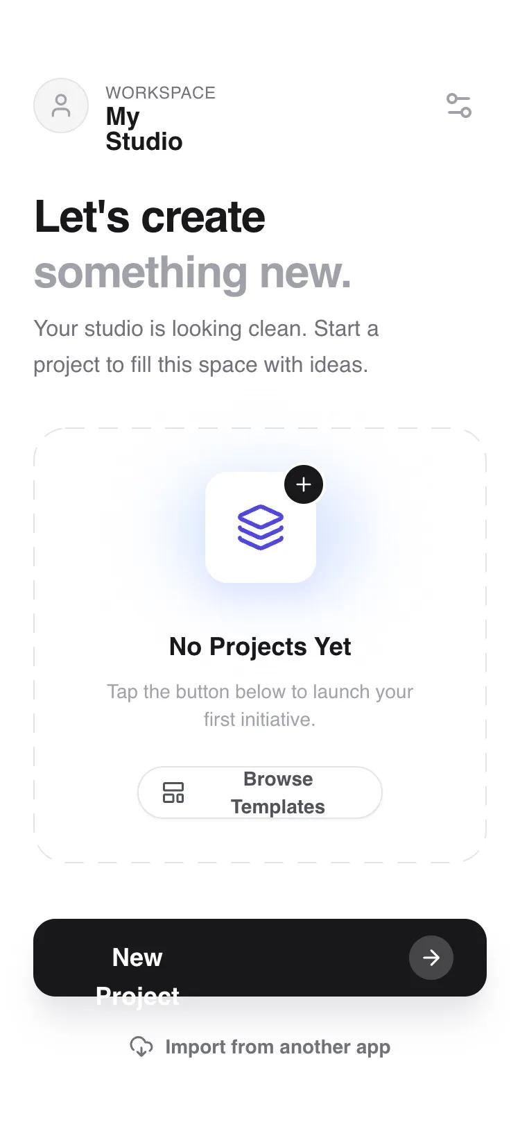 All Prompts
mobile apphomelayout
Zero-State First Home
Минималистичный UI-макет для первого экрана: объяснение, плейсхолдеры и главное действие. Идеален для пустых состояний, онбординга, UGC.
by Shirley LouLive Preview
Prompt
# Zero-State First Home

{
  "summary": "A modern mobile app layout specifically designed for empty or first-use states, featuring a refined vertical hierarchy, editorial typography, and an animated placeholder slot that maintains visual interest without content.",
  "style": {
    "description": "The 'Orbit' style uses the Satoshi sans-serif typeface family with weights ranging from 400 (Regular) to 900 (Black). The color palette is built on the Zinc scale (#18181B for text, #71717A for secondary, #F4F4F5 for backgrounds) with Indigo (#4F46E5) for interactive accents. Visual flair is added through subtle mesh gradients (blur-xl), dashed borders (12px dash, 12px gap), and smooth spring-like micro-interactions. Shadows are soft and layered (indigo-100/zinc-200) to create a sense of depth and elevation.",
    "prompt": "Create a design with a pure white (#FFFFFF) background. Typography: Use Satoshi; Headlines at 32px (Black/900 weight, -0.05em tracking), body text at 16px (Medium/500 weight, Zinc-500 #71717A), and labels at 12px (Bold/700 weight, uppercase). Colors: Primary text #18181B, Secondary text #71717A, Border #E4E4E7, Accent Indigo #4F46E5. Spacing: 24px (6 units) standard horizontal padding. Shapes: Use a 24px border radius for cards and 16px for secondary containers. Interaction: Buttons should have a slight scale-down (0.98) on active states. Decorative: Include a dashed border visual using a stroke-dasharray of '12, 12' and rounded corners. Shadows: Use a large, soft shadow-xl (offset-y 20px, blur 25px, spread -5px) for the primary footer button using rgba(24, 24, 27, 0.1)."
  },
  "layout_and_structure": {
    "description": "A vertically stacked mobile layout consisting of a fixed-top header, a fluid scrollable main content area with editorial copy and a central placeholder 'slot', and a fixed bottom footer for primary actions.",
    "prompts": [
      {
        "part": "Header Bar",
        "prompt": "A 56px height header with 56px top padding (safe area). Left side: A 40px circular avatar/icon container (Zinc-100) paired with a vertical text stack (12px uppercase label above an 18px bold title). Right side: A 40px circular ghost button containing a 24px settings/filter icon. Apply a subtle backdrop-blur (8px) and 80% white opacity."
      },
      {
        "part": "Welcome Section",
        "prompt": "32px vertical padding. Feature a 32px font-size headline with tight line-height (1.1) and black weight. Use a two-tone text approach where the second line is muted (Zinc-400). Follow with a 16px leading-relaxed paragraph, max-width 280px, in Zinc-500."
      },
      {
        "part": "Empty State Slot",
        "prompt": "A flexible central container with a 24px rounded dashed border (#E4E4E7). Inside, center-align all elements: 1) A 128px animated visual anchor consisting of two overlapping soft-blue/indigo blobs with blur-xl and a slow scale-bounce animation. 2) A 80px white rounded card floating on top with a shadow and central 32px indigo icon. 3) A text group with an 18px bold title and 14px muted description. 4) An optional secondary button (ghost style, 14px bold text, rounded-full) at the bottom."
      },
      {
        "part": "Footer Action Bar",
        "prompt": "Sticky bottom container with a white-to-transparent gradient overlay. Contains a primary CTA button: 56px height, rounded-2xl, Zinc-900 background, 18px white bold text. Include a 32px circular pill inside the button on the right containing an arrow icon. Below the primary button, include a 48px height text-only secondary button for low-priority actions like 'Import'."
      }
    ]
  },
  "special_ui_components": [
    {
      "component": "Animated Icon Anchor",
      "description": "A layered, animated visual centerpiece for the empty state.",
      "prompt": "Construct a 128px square relative container. Place two 'blobs' (absolute inset-0, rounded-full, 70% opacity, blur-xl) using background colors #DBEAFE and #E0E7FF. Apply a CSS keyframe animation 'blob-bounce' (0%, 100%: transform: scale(1) translate(0, 0); 50%: transform: scale(1.05) translate(5px, -5px)). Center a 80px white rounded-2xl box with a 1px border (#FFFFFF) and soft shadow. Inside the box, center a 36px indigo icon. Add a 32px black circular 'plus' badge overlapping the top-right corner with a 2px white border."
    },
    {
      "component": "Primary Action Arrow Button",
      "description": "A high-visibility button with a nested icon badge.",
      "prompt": "A 56px tall button with Zinc-900 (#18181B) background and 16px rounded corners. Horizontal padding of 24px. The label 'New Project' is 18px bold white. On the right, include a 32px circle with background white/20 and a 18px white right-arrow icon. Add a hover state that increases the circle background to white/30."
    }
  ],
  "special_notes": "MUST: Use -webkit-font-smoothing: antialiased for the Satoshi font to maintain premium feel. MUST: Ensure the primary action button has a high-contrast shadow (shadow-zinc-200). DO NOT: Use standard 1px solid borders; use the custom 12px dash pattern for empty states to signify 'available space'. DO NOT: Overcrowd the 'Welcome' section; the white space is critical for the 'clean' aesthetic."
}